
As you might expect for a warm-associated colour, warm Seasons (groups of natural colouring) have many choices, as do 4 of the groups with some Spring in their colours (Light Summer, Light Spring, True Spring, Bright Spring).
But everyone has a version of yellow in themselves and therefore among the colours they wear beautifully.
Our perfect light
The light surrounding us is the reason you can see other people and they can see you. We’re not prisms that split light, we are more like coloured objects for absorbing some wavelengths and sending the others out. In our case, we emit many different colours of light, yellow among them. Cool Season people radiate a cool yellow light, warm Seasons radiate a warm yellow light.
Colour harmony is a gift given to every person, meaning that the many colours we emit are already in perfect harmony. Amazing! In humans, that built-in colour harmony is called Season. We might not see the colours of our light consciously or separately, but being as sensitive to colour vibration as we are to sound and taste vibration, we register them subconsciously. The colours of our light are the best colours we can wear because they cooperate with what’s already there.
What makes harmony so powerful is that we see, hear, or taste beauty as a unified whole, in a person, recipe, melody, or appearance. Wear your own colours together and the unified effect picks up speed, like compound interest, a logarithmic curve, a big effect in a compact space. And to think it’s just built-in biology, already part of you.
Today, we focus on our yellows. We'll see how Spring’s light appears to shine through colours, making sheerness, layers, and transparency so beautiful, and how Autumn’s light is able to go around objects, making 3D effects so becoming. We’ll see how Autumn colours are like Summer's in being soft, just asking to be combined, compared with Winter’s colours that shine when they stand alone.
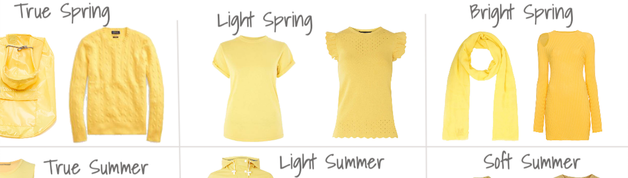
Panel 1, Yellow for 12 Seasons

Shopping information: https://urstyle.fashion/styles/3210347
Yellow strikes us as bright. As a light colour, it advances so things may seem nearer or larger. To narrow down the information in the chart above, let's look row by row.
Panel 1: Spring row
Spring yellow is the colour of warm and clear sunlight. The yellow is fairly bright and gentle at the same time, as are all the colours, being in perfect harmony and therefore having shared colour properties. True Spring is the warmest of the Springs, so warmed with red that it looks almost peachy in the same way that the white looks ivory.
Light Spring is a neutral colouring, between warm and cool, so they have cooler and warmer versions of all the colours. Overall, the colours tend to the warm side of middle, giving this group the warm-neutral (or neutral-warm) setting. The yellow is not as warm as True Spring and not as bright because Summer colour properties are mixed in, which also makes the colours a touch cooler.
Bright Spring is the colouring type where Spring mixes with a bit of Winter, so colours are very pure, not dusty at all, since brightness (pure pigment) is a property of both parent Seasons. Like Light Spring, there’s a warm and cool range for this neutral-warm type of colouring.
Reader question: Why can't I figure out if I'm warm or cool?
For 2 reasons:
1. Most people are neutral in warmth, between warm and cool, giving them a range of warm to cool in the colours they wear extremely well.
True Seasons, the fully warm or cool ones, are not rare. It's just math. Of 12 Seasons, 4 are True, meaning full warm or cool, so about ¼ of people. The rest float in a range somewhere in between the warm or cool extremes, called neutral, so 75% of the population.
The same may be true of colour anywhere. If you gathered up 100 yellow items, those at the far ends of the warm to cool range would be the minority, with most somewhere in the middle.
This math isn’t perfect, it assumes that Seasons are evenly divided among people, which is probably not an accurate representation of reality.
2. You can't tell warm or cool colour by looking, in a person or anywhere else. As a colour property, warmth is comparative, meaning a colour is warm or cool depending on the warmth of the colour beside it. Plus, in a person, the colours of light we emit are registered subconsciously.
To know a person's warmth level, we ask them their colours to do something, put them into action, and look for expected reactions that we can see and measure. By asking their light to react to colours of known warmth levels, we are able to determine the warmth of the colours in the person, which are all at the same level or very close. You'll see the process in action as part of an in-person colour analysis.
Back to the chart,
Panel 1, Summer row:
Summer yellow is a light, cool pastel. For yellow, cool means greenish, so we don’t see peach or orange across this row compared with the Spring row. Pastel means soft, which comes from visible gray, not sharp or frosty which would come from being closer to white. In the True Summer row, the bow is really good, a cool yellow with softness in both colour and reflections visible as soft gray. The sleeveless top is cool but is it soft enough, but it seems icy compared with the bow. Keep it in mind, we’ll see it later and put it to a test.
Light Summer has a little Spring in the mix, so the colours brighten with more pigment than the bow but less gray. Spring also brings warmth and compared with True Summer, perhaps we do see a touch of peach, though not as much as Light Spring above.
Soft Summer: Yellow is a colour in which the purer the pigment, the lighter it gets (blue is the opposite). As a Season of soft colours because the parent groups of Summer and Autumn are soft, yellow is a touch darker. Soft Summer yellow brings to mind lemon ginger tea, either cloudy or watery, without the density of materials like brass. There’s a lighter version too, which we’ll see later.
Panel 1, Autumn row:
True Autumn yellow is gold. Colours may appear orange or terracotta from the warmth of the added red, or brown which is dark orange. Darkness is an important property of Autumn, which is different from saying all the colours are dark, that’s not true for any Season. Autumn colours may feel brighter than they are from the warmth of that golden glow.
Soft Autumn is a neutral Season, where Autumn mixes with a touch of Summer. The Season has the same warmth level as Light Spring, neutral-warm, but the Autumn softness and darkness give us buff and broom yellow.
Dark Autumn yellow has greener and redder versions, as do all 3 Autumns. Dark Autumn colours are dark and bright enough to balance black quite well, making for unique contrasts of dark with warm or high contrasts that are softer than black with white. The effect when colours combine is rich and strong, same as if the colours were flavours.
Panel 1, Winter row:
True Winter has lemon yellow. You may see a trace of red in the yellow, as in the blouse on the right, but still cool relative to the other Winters.
Bright Winter brings in some Spring, combining the brightness of both parents. This yellow is a little warm and we recognize the peachy warmth of True Spring. At this high brightness level, the colours feel very warm, possibly warmer than they are because this is a cool-neutral colour group, the same as Light Summer.
Dark Winter is the softest of the 3 Winters, having one Autumn parent. Yellow is still near primary yellow, lemony in the cool version, as well as a warmer and darker yellow that looks Autumn. A Dark Autumn might wear it quite well, better than the lemon yellow, but it might be brighter than the person and the rest of their outfit.
Panel 2, Handbags for 12 Seasons

Shopping information: https://urstyle.fashion/styles/3211154
People either feel comfortable with yellow or shy away from it, often the cooler Seasons, maybe because it’s harder to choose or find. Yellow is a happy, alive, interactive colour. Not wearing it is like leaving vowels out of our alphabet. Nothing else can do what it does, both visually and how we’re wired psychologically. Colours talk to us, they have a voice, we find meaning in them, which is why our wardrobe says so much when it includes one of every colour family in our own Season.
Handbags are ideal because they come in every colour and coordinate with outfits, but we don’t see them near our face, giving them flexibility. Even phone cases and tea cups are seen near the face more often. Since the more ways we see something, the better we understand it, let’s look at the 12 Seasons again in this new item.
Panel 2, Spring row:
Spring shows its warmth with clear yellow, the colour that unifies all the colours of the Season, the colour of the light shining down on this entire world.
For True Spring, yellow ranges from buttery to egg yolk. Yellow is medium bright, and compared with Winter, it actually seems a little soft. True Spring is focussed on being warm, not on being bright (every Season is focussed on 1 aspect of colour and is more medium about the other 2). A little softer, a little brighter, the slider moves up and down through the middle ranges.
Light Spring has a cooler version of butter, still quite clear, and also lighter, a colour we see in varieties of daffodils. The metals in the purse work with Light Spring's ability to wear silver as well as gold, and smooth shine as well as brushed.
Bright Spring is brighter than True Spring, with a warm and cool version of all the colours. We see cooler yellow in the hat, still with too much warmth for any Winter, and warmer yellow in the bag with that interesting bright rust detail that elevates the effect from a simple yellow purse.
Panel 2, Summer row:
Summer cools colours by adding blue. This gives yellow a greenish quality that is never acidic, thanks to the softening with gray.
These True Summer items may be better examples than the sleeveless top in Panel 1. More yellow pigment helps the watchstrap and handbag look less icy and more pastel. Pastels are quite far from white, never frosty, even the lightest ones. The white watch face might too sharp to wear near the face, but in this small area, True Summer can make sense of the lightness and coolness. The metal may have some warmth but the area is small, works with the item, and we give latitude for accessories.
Light Summer is slightly warmer, less green more buttery, and has a soft to bright range, which you can see in these bags. Neither is as bright as the Light Spring item above. Light Summer also has a cooler version, a softer lemon.
In Soft Summer, we see visible gray and a greenish cast, but not lime. A touch of Autumn gold warms the colours, perhaps not enough to make a distinct warm impression in this cool-neutral Season. A lighter yellow is shown in front, but it’s not creamy. As Autumn arrives, brushed textures like suede are beautiful for their strength and colour-softening effect, as is the stitch effect alternating yellows in the rear item. The metals on the purse in front may not be ideal, as we saw for the True Summer watch, and satined silver would be better but not a dealbreaker, since there is a little gold in the handbag's colours and the gold of the metal isn’t overheated.
Panel 2, Autumn row:
True Autumn is the warmest of the Autumns and medium-soft. We don't see traditional primary yellow. With the warmth, softness, and darkness of Autumn, the palette includes yellower option like camel and more orange or saddle colour choices. The metals are excellent in these examples, with the darker gold in front and embossed gold in the back, both wonderful ways to add texture and in tune with the item itself.
Soft Autumn yellow appears as soft, warm muted yellow and many variations of acorn browns. These have the same warmth as Light Spring above, neutral-warm, but they are softer and reach a darker endpoint.
In Dark Autumn, we find more pigment than True Autumn as Winter arrives. There’s magic when colours and textures come together, nowhere more so than Autumn. Large areas of single colour are improved with metal, stitching, suede, stones, and buckles, with the size and style of the items adjusted for your body type.
Panel 2, Winter row:
True Winter's lemon rind is here, and no doubt there are birds and fish with this type of yellow too. We see red in the one at the back, although different from the peachy sweetness of Bright Winter's similar yellow. The red makes the yellow natural for humans, meaning that the red from blood below the surface is visible through the semi-translucent skin layers above, and has influence on how yellow appears.
Bright Winter shows a cooler lighter yellow and the darker warmer end of the range. Both are clear or bright, meaning lots of pigment, not powdery or dusty. Dark Winter to the right is bright as well, but not as yellow as Bright Winter. Nice hardware in both items, I find many variations of rose gold are most comfortable with Bright Winter, especially when the metal is shiny.
For Dark Winter, if you were given this colour and asked to add it to the chart, you might choose the Winter row, noticing that it is the softest of the Winters.
Panel 3, Yellow for 3 Springs

Shopping information: https://urstyle.fashion/styles/3211761
True Spring colour is very warm, light to medium in darkness, and medium-high in brightness, whereas True Autumn is med-lo; neither is at the extremes of soft or bright. The transparency of the stones in the earrings is a superb Spring effect, like water in the Caribbean ocean, that shiny luminous quality that we sense in this kind of clear yellow light. Gradients are beautiful too, as they are in Summer, because the people don’t have bold colouring in the sense of big colour transitions from one feature to the next. The feeling is more sweeping, with a gentle charm, and beautiful when the colours they wear repeat that.
Light Spring has a series of lovely easy light yellows. Neutral Seasons add to the experience by wearing their warm and cool colours together, here in the fabric of the dress with the cooler yellow band at the hem, or the gold and silver in the bead necklace. Spring also enhances the lighthearted effect by combining gentle opposites, such as gold and silver.
Bright Spring's version of yellow is brighter than either row above, though not as bright as Bright Winter. We see cool yellow in the sundress, but not lemon rind. The scarf is an orangey yellow, with lots of pigment and shine so the effect is light and bright, rather than earthy or soft. The shine also affects how light is reflected meaning there’s a jewelled quality to this item. The bright rust in this Season reminds me of a varnished guitar, in the handbag and excellent in footwear too, particularly when the colour is present in the eye or hair colours.
About the hat on the right side, does it have a home here? Comparison is how we understand colours. Understanding is knowing what to do. If you’re a Spring, do you buy the hat or keep shopping? Keep shopping, I think.
Panel 4, Yellow for 3 Summers

Shopping information: https://urstyle.fashion/styles/3211657
True Summer. The shoes…do you see gray or orange? Gray. Orange or green? Green. Gray or green? Both. It's an amazing thing that when this person wears it, it doesn’t look greenish at all, or gray. It looks like beautiful clean yellow, a delicious refreshing lemonade.
In the Light Summer row, the men’s Polo shirt shows the lighter side of Light Summer pastels. The softness is here, Spring's airy quality rather than earthy or harvest as Autumn would have. From a reader's brilliant suggestion, this colour is now called Passion Fruit Mousse. Prints, as in the dress, are a great way to understand colours. Compare the yellow with True Summer and see that here, it's a bit brighter and warmer. The print colours are softer than the yellow, possibly belonging with another Summer, with enough in common to create a beautiful effect. The shoe yellow is warmer and brighter, but still on the cool side. As the brightest of the 3 Summers, Light Summer is bright and light enough to work with white in the sole, though this white might be too bright in large area or near the face.
In Soft Summer, we see our lemon ginger tea or another example might be butterfly wings for that dusty, powdery quality. The metals of this purse seem orange and hard to see or too shiny, but purses have more flexibility compared with earrings, which we see near the face and next to the skin. Soft Summer yellow in metal might look like the jewelry item beside the purse, although any light-medium gold could be fine as long, avoiding an orange cast, the one colour that doesn't appear in this palette. When Autumn arrives, texture works very well, as woven or knitted textiles such as the scarf, also with that feeling of interlacing that looks so good with Summers. We see the Autumn-flattering 3D effect in the embossing in the coins, a gentle way to texture metals and elevate the colours in this Season.
How about the hat? Can it find a home in these closets? Could you slide it into any row without anyone noticing? Not if your eyes work like mine. You almost want to push it further off the screen and let your eyes can relax.
Panel 5, Yellow for 3 Autumns

Shopping information: https://urstyle.fashion/styles/3211665
True Autumn yellow is warm and rich, easy to see the gold in these colours. Gold is deeper and richer than yellow and is iconic for Autumn, just as clear yellow is iconic for Spring. Texture adds benefits for Autumn, making colour a little darker in the folds and softening brightness. The colour of light going into an object or a landscape has everything to do with the colour that comes back out, and Autumn light is long and low, from the position of the earth and sun at this time of year or at the end of the day. Angled indirect light creates rounder, 3D shapes compared with overhead light, and red wavelengths make for warmer colours.
In Soft Autumn, we recognize the pastels of Summer in the gown as light and soft colour, with a powdery feel, more like a wheat field than a variation on cotton candy, which would be more Spring. The T-shirt and pants are great as well, enhancing the blue-greens that may be in the eyes and gorgeous with any yellow or soft orange, also often found among the eye colours.
The Dark Autumn leather jacket colour is among the lightest colours for this Season, not icy like Winter, but light relative to the other colours. The colour is similar to the gown in the Soft Autumn row without the softness. This paint would be opaque, higher in pigment with less of the dusty powdery quality. The shine in the blouse is sharper, an example of how reflections brighten with Winter arriving, but it’s a warm shine because the colour is warm. Texture may be matte, suede, or velvet for this primarily Autumn group of colours, and warm or metallic shine is extremely belonging as well. The shoe is a less shiny version, that old gold quality.
We're not even going to try putting the yellow hat in here. Instead, we have the camisole on the right. These sunrise-sunset apricots have beautiful warmth, but at this brightness or higher, the colour may not be rich enough to work in outfits except possibly as one of the lightest options for Dark Autumn, the brightest of the 3 Autumns. Within the same colour family, look for a softness that could slide into your row and be perfectly calm and at home.
Panel 6, Yellow for 3 Winters

Shopping information: https://urstyle.fashion/styles/3211785
For True Winter, the faux fur coat could be an example of icy or lightest yellow, much like lemon zest. The centre coat and shoes are the same colour moving along the same path. As we saw in the 12-grids earlier, there is red in this yellow, compared with acidic, neon, or highlighter yellow green, an artificial colour I don’t think humans have. Yellow and diamonds in the sandals, a surprising success.
Bright Winter's canary yellow is brighter and a bit warmer, giving it a sweetness or innocence that seems paradoxical in this cool-neutral Winter.
Dark Winter's handbag is an example of how colours find balance. As a rule, Winter colours will be comfortable with black and white and make effective combinations. Earlier, we mentioned that Dark Autumn forms great dark and warm contrasts with black, however it cannot do the same with white. About the blouse, the texture and overall look feel opaque and solid, more Autumn-like, but any texture can be found in any colour. Bright Spring has similar colours. Although the blouse might be worn well by either group in their different combinations, one way to decide which Season is best may be to try it with another colour family in versions that are iconic for each Season. The coral circle on top is Bright Spring, the lower red might be Dark Winter. Which one would you choose for a jacket or lipstick? My opinion, I might choose the Dark Winter, the colours seem to hold their own and look better together, richer, and stronger. The Bright Spring on top seems bouncy, harder to take seriously. A Dark Winter who is near True Winter might never wear this blouse for the warmth and resemblance to Autumn colours.
On the right side of the line, we have 3 demo stations.
At the top, we see shoes with a yellow Summer heel, could be True Summer for the cool colour and the visible gray. Joining us again from Panel 1, we have the sleeveless top, which I thought might be a little icy there but acceptable for True Summer. Here, I'd find it workable for the True Winter row as well, one of those colours that could bridge both Seasons well enough to participate in the wardrobes.
In the middle are the Hiliter colours, the acidic green-yellows in the purse and turtleneck. The colour seems synthetic, not a natural yellow. Human pigments don't make us squint, but this could. These neon yellows may be found in some True Winter palettes and if anyone’s going to wear them with outfits, it will be that Season, but I don’t see it as the best interpretation of their yellow. As accents or highlighters, the colour would be easier and more adaptable.
In the lower right is our hat again. It's not highlighter acidic yellow, but close. Too clear for Dark Winter. We want a good fit with our Seasons especially for hats, hair colour, or umbrellas, because the colour will frame the face. I would choose True or Bright Winter.
Panel 7, Yellow and Jewelry

Shopping information: https://urstyle.fashion/styles/3211858
Jewelry, or gold, is another application of yellow. We want the colour of the metal to slide into the yellow strip of our Season palette, have continuity with the yellows in the palette, and by extension, look well with our clothes and our skin tones.
The Seasons named in each row refer to the items of apparel.
In Spring, gold is yellow and shiny, replicating the sunlight that beams from the colours and person. The watch for Bright Spring is a warm rose gold, similar to the dress. The teardrops might be for Bright or True Spring and the small diamonds earrings in a cooler gold might be a good choice for Light Spring (or Light Summer), or any Spring since the properties of warm, light, and clear are satisfied. As a medium-softness Season, True Spring wears softer shine just as easily in jewelry and apparel. The Neutral Springs, Light and Bright, wear silver and gold, with their medium warm-cool setting finding a home for either metal.
In the second row, the sweater could belong to True Summer or the cool side of Light Summer. Between the silver and the gold earrings, I prefer the silver. The yellow in the hoops becomes orange, meaning the colours change one another, whereas the silver earring looks clean, the shape is easy to see, and the gray shine has some continuity with tones in the sweater. Not only do they not alter one another, they improve each other. The yellow gold suits Light Summer yellow in the dress, with similar tones visible in both. The wider chunky hoop on the far right would be great for Soft Summer, with the pearlescent diffused reflectivity that is beautiful for Summer. Even without a Soft Summer item in the row, the earrings fit with Summer best, meaning they share more than they differ.
In the Autumn row, the discs earrings seem to work with Soft Autumn, but not as easy to slide into any other row. The centre earrings would work for True or Dark Autumn, a warm gold like in a darker, richer, deeper colour than Spring. Textured metal is optional and looks terrific. The bracelet has bronze tones, a possible choice for Dark Autumn and Autumn in general.
The Winter row is organized differently to bring the clothing and jewelry items closer together, the way they're seen when we wear them. The closer together colours are, the more influence they have on one another, for better or worse. The yellow cardigan is venturing into highlighter territory, but illustrates the possible discord between saturated true cool yellows and gold, a feeling of repelling magnets. True Winter skin tones have that same cool saturated yellow and gold may be hard to see next to the skin or appear yellower and darker and less expensive. Silver is terrific, crisp and clean, black as well, both easy. Gold looks better with the Neutral Season Winters (Dark and Bright), as in the gold earring with the Bright Winter slingback. The chunky diamonds and primary red stones make the item even more compatible with Winter, compared with the gold hoop and pearl in the Summer row, which might get lost next to the brightness of the clothing colours, and therefore the person’s colours, all links in the same chain.
Yellow and Hair Colour
One topic we didn’t touch on where yellow applies is hair colour. How we react to colour is the same however and wherever we wear it. The yellows above can give you an idea of your best highlights or colour range.
But hair is a unique application with a unique psychology and role in appearance. Best colour is related to Season, but also to your natural colouring and darkness level. Also, hair colour is like lipstick in that it's applied to an area that is already pigmented, which affects the final result.
You can certainly generalize about colour in your Season because that’s the code for how you react to colour. For each individual though, hair colour is a one-person-at-a-time decision.
12 Blueprints on Pinterest
I hope that you’ll go to Pinterest. The 12 Blueprints boards are here.
I recently pinned yellows for each of the 12 Seasons, linked to current retail. Spend just as long looking at the yellows as the balance with the other colours.
Use my pins in your own boards, as well as those of others showing landscapes and other items in your Season. Add items you think of buying into the gallery and see if they could belong without disturbing the peace.
For online shopping, some folks open my board for their Season in one window and their shopping window on the other side. If they could insert the item into the board easily, it may be a good choice.
Comments? Questions? Great!
Anything you want to ask or talk about? I’d be happy to have a conversation in the comments section of the video, Your Best Yellow, here on YouTube.