
This post is the continuation of Part 1, looking at alternatives for white, black, and a colour that is extremely appealing for each of the 9 Seasons whose colour dimensions differ from Winter.
Our approach will be to how to create high light to dark contrast using colours that are more flattering than white and black. Because we don’t start from the same place in our natural colouring, another way of combining colour may be more meaningful than high contrast and we'll discuss how to celebrate the colours effects that our unique colouring wears extremely well.
As a reminder, our discussions are about colour and getting the most from your colour palette, not about style. Our colour palette is an amazing toolbox that may benefit from explanations, like a How-To guide. E-Books are available worldwide as digital downloads here or under the E-Books tab in the main menu.
True Autumn
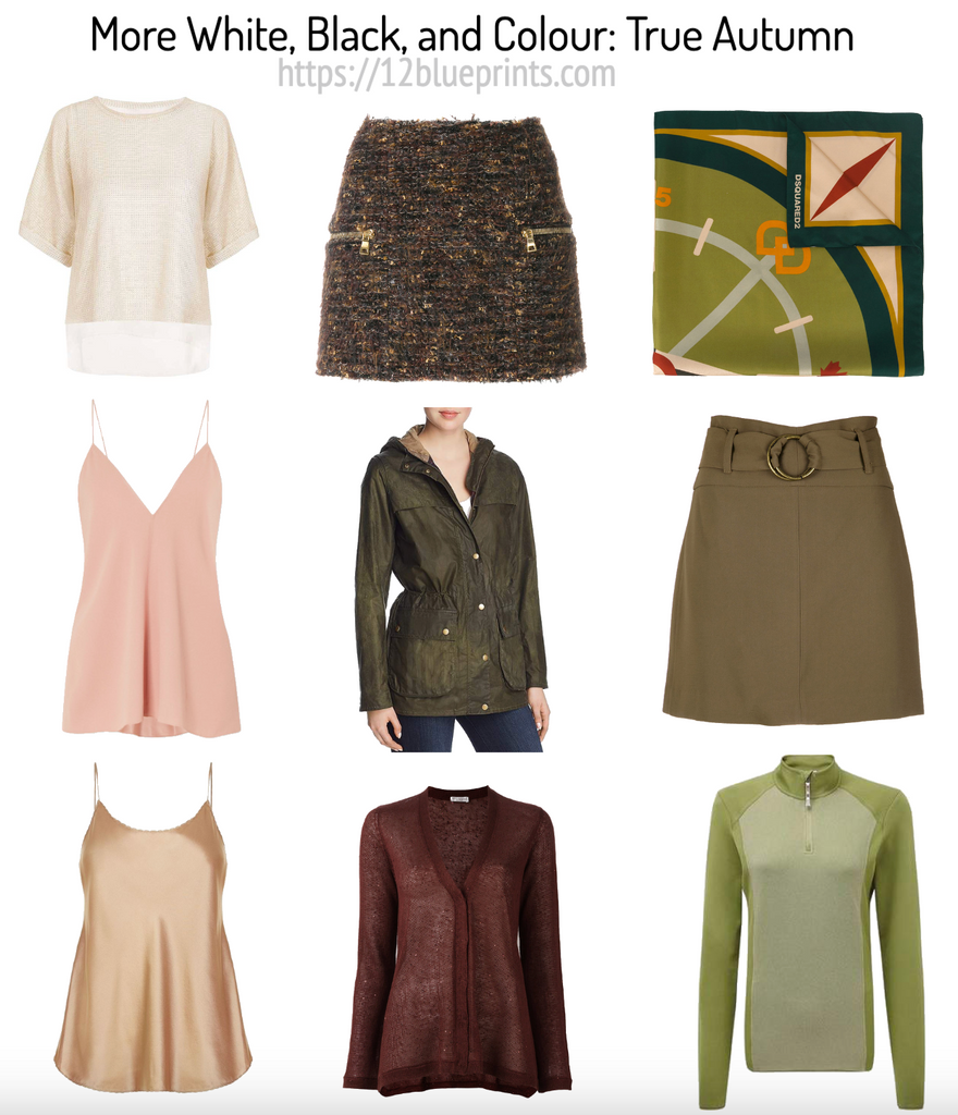
Shopping information: https://urstyle.fashion/styles/3640667
We looked at light neutrals for True Autumn in an earlier video/post and saw many white, beige, and brown options. The white is a darker white in a colour Dark Autumn might also wear and a textured material that adds to the Autumn effect. Next, soft salmon beige may be a good substitute for white, light enough to create contrast with the darker tones.
Gray may be hard to find for the warm Seasons, but alternative colours are plentiful, in medium and dark shades that may act as neutrals or colours in the wardrobe. Gold plus texture are featured in the skirt at the top of the second row, with golden threads woven into a dark brown backdrop, and golden zippers adding to the look. Below, the dark olive jacket shows nice attention to detail, with the fur lining of the hood and the buttons in harmonious colour choices that could be combinations in a suit, blouse, and necklace. Next, dark maroon is another rich and versatile black alternative.
Third row: A True Autumn-coloured forest would look odd and less splendid painted in two blocks of single colour and neutral, orange and brown, for example. Combining single colour with neutral is effective and complete look for Winter. For Autumn, however harmonious the colour choices, a multicolour effect plays better to its strengths. The scarf is a beautiful medley of light and dark tones, with colour diversity in red and green, orange and yellow. The high colour brightness of Winter makes the colours most effective when they stand alone, while softer Seasons look better when colours are used in other ways than stand-alone brightness or extreme light-dark contrast, neither of which express the person's natural colouring.
Next is the green gold skirt, a bronzed green. This colour or a touch darker like the jacket in the centre row, has a great smoothing effect for the skin texture. The item at the bottom includes two lovely shades of green, with the lighter green colour or a shade lighter in the palette as another example of an alternative for white.
Soft Autumn
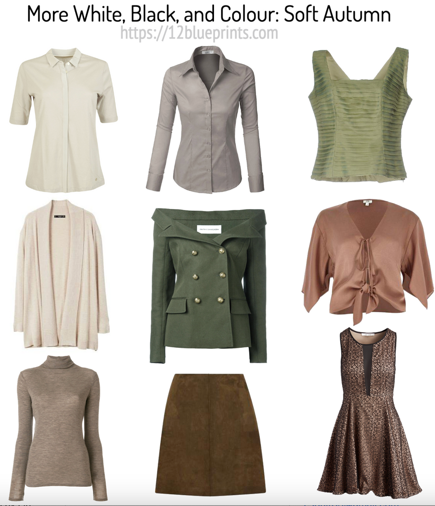
Shopping information: https://urstyle.fashion/styles/3640877
The calm gorgeousness that is Soft Autumn. In the first row, the blouse shows a white alternative with a touch of golden warmth and a slight greenish tinge often found in Soft Autumn white and light beige. Below is a more traditional beige that could be called oatmeal, with visible warm tones, not to the extent of the stronger gold or red of True Autumn. Next, a medium dark neutral brown, like a dark mushroom colour. The mixed colours in the fibres are fantastic for this Season, and True Autumn too, as we saw in the skirt with the zippers in the previous image.
The second row might be examples of black alternatives. The shirt at the top is medium gray. Soft Autumn is the lightest of the three Autumns and overall presentation might average around a medium to medium-dark overall darkness. A combination of one of the whites with this gray colour in a pant may be an example of a lighter, yet elegant and balanced, overall effect. Below that, the gorgeous khaki green jacket, one of the palette neutral tones with a good choice in the metal of the buttons. Next, the suede skirt in a colour and textile that are beautiful with this colouring and great substitutes for black.
Third row, the light cactus green includes texture in the pleats, with repetition that works well for Autumn, like a staircase or ladder effect, balanced with the refinement of smoother fabric. Shine is moderate with the light and the dark tones close to the base colour, a good effect for Summer and Autumn colouring.
Below, an example of rose gold that works as apparel, jewelry, a highlight in the hair colour, eyeshadow, or an easy lip colour. Like coppered rose sand, we see another type of shine but different from the top above, more dry and slightly metallic. Next is the dress with mixed lighter and darker browns. In the darker brown on its own, the darkness limit may be met or exceeded, but with the light colour blending in with the print, the overall effect is medium dark and enhances the brown with the unique golden glow of Autumn. In a room full of black, this would be a stand out dress, or for a noontime lunch date, also fabulous.
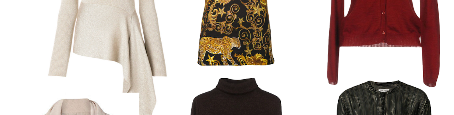
Dark Autumn
Shopping information: https://urstyle.fashion/styles/3642476
Among the white alternatives, the one at the top is a little more golden while the one below features more red orange tones, both lighter than True Autumn but not white enough for Winter. Third is a neutral golden beige with a slight olive cast, an excellent option that can participate in high contrast since the dark tones are very dark in this Season, giving a more Winter-like impression for the Winter influence in this group.
Second row, the T-shirt is one example for warming up black. Black is perfectly fine because high darkness is part of the colour dimensions, but dark and cool may be detracting. The solution is to add warmth to black, either in a print like this with generous areas of gold and burnt orange, or to choose a black that has visible warmth, like dark roast coffee beans.
Next is a dark brown turtleneck, an incredibly flattering colour that looks better with the palette colours and the person than black. The dress below is an ingenious combination of neutrals using light greige, golden green, and whiskey brown. Black is limited to small areas, used to define shapes and add definition to colours, without being a significant colour element in the print.
Third row at the top, we have a glowing warm red. Dark Autumn is like the coals at the end of a campfire, where black combines with intense glowing warmth. Next, the blouse includes black in the colour but it's not the predominant feature of the colour or what makes the colour beautiful. Below, another red or burgundy that might be mistaken for black in dim light but as soon as light, even candlelight touches it, we see that the colour is a dark burnished red, Dark Autumn's own brand of magic.
True Summer
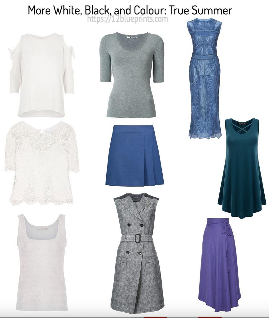
Shopping information: https://urstyle.fashion/styles/3640666
Texture enhances Autumn colours. High value (light to dark) contrast does the same for Winter. Summer's associations communicate peace and grace.
Calm looks strong on Summer. While every Season can create every effect with their own colours, certain ways of wearing colour speak more for the person than others. In their colours, Summers look settled, healthy, capable, and controlled.
In the first row, we have whites that are softer than snow or the background white of the page. The second item may have a tinge of yellow (or the colour is from lighting) but not enough to place it into Spring or Autumn. Below, the light gray tank top has a subtle silver shimmer throughout, and you may be able to see a bit of a pink tinge in the silver.
Next row at the top, a medium-dark gray with beautiful blue and green tones woven into the fabric. One way to distinguish Winter and Summer neutrals is that Winter neutrals do not have a lot of colour pigment. If you lay a piece of silverware on this blouse, the blue and green pigment would be more noticeable, whereas Winter grays look about the same, with little visible pigment.
In the center is a blue that might act as a black alternative, meaning a darker neutral in the wardrobe. The dress below has a variegated white and blue gray colour effect, with a blue gray detail at the shoulders. The contrast is moderate and perfect for Summer, including the buttons in the belt and the stitching. The print recalls flowing water.
Third row, the dress at the top may be a conventional colour for True Summer, familiar as business or office shirt blue, but once style steps in, the item becomes as spectacular for Summer as black can be for Winter if the garment is special. Next down, the dark teal is among my favourite colours for True Summer and a great black alternative. The purple skirt below is blue-violet, a colour that resonates well because the natural colouring is blue and pink-based, making this colour beautiful in any garment or accessory.
Light Summer
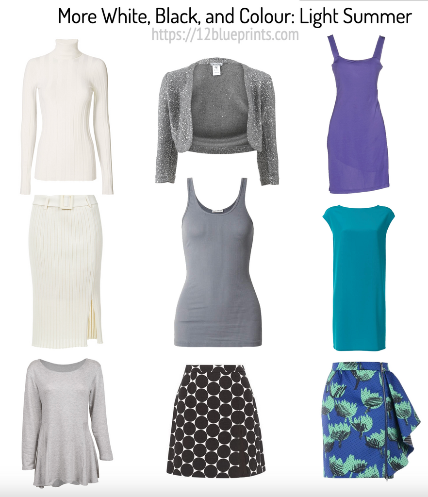
Shopping information: https://urstyle.fashion/styles/3640664
Beginning with two whites, the warmth is yellow, rather than gold. The skirt below has more yellow pigment in a textile that softens the colour for Summer. Wearing the light colour in the lower half adds diversity to the wardrobe and helps keep the overall darkness of combinations around medium, in keeping with the person wearing them. Below is soft light gray, a colour that may be most beautiful and meaningful for Light Summer, including casual styles.
Centre row, sparkle and twinkle are Spring's world with the shrug at the top inviting Summer with a medium cool gray and delicate sparkle. For the Light Summer person, this colour serves as an excellent medium dark neutral. Extreme light to dark contrast is not a feature of the natural colours and part of their special magic is that medium light and light colours are effective to balance and complete outfits. Darkness is neither necessary nor helpful, although it serves other purposes, such as adding interest and diversity to the wardrobe.
Colour palettes may be found with surprisingly dark versions of neutral browns, which are interesting depending on the person. This skirt places the dark colour further from the face, combines it with a light colour to lighten the overall effect, and features a bubble print that adds lightness or lift, all good effects for the Light Seasons.
Once Spring influences the natural colouring, as it does in Light Summer, colour is among the magic ingredients for appearance. As we saw with violet in True Summer above, the violet dress is one of the best colours, complimenting the Spring yellow tones in the natural colouring. The next item shows on of the darker blue greens, a colour that is special on every Light Summer. The skirt is an example of how this saturated Summer might wear a Winter-like effect, using light colour (the green) and charcoal (the graffiti) rather than black and white to create contrast, adding blue violet as a background to ease the colour transitions and include Spring.
Soft Summer
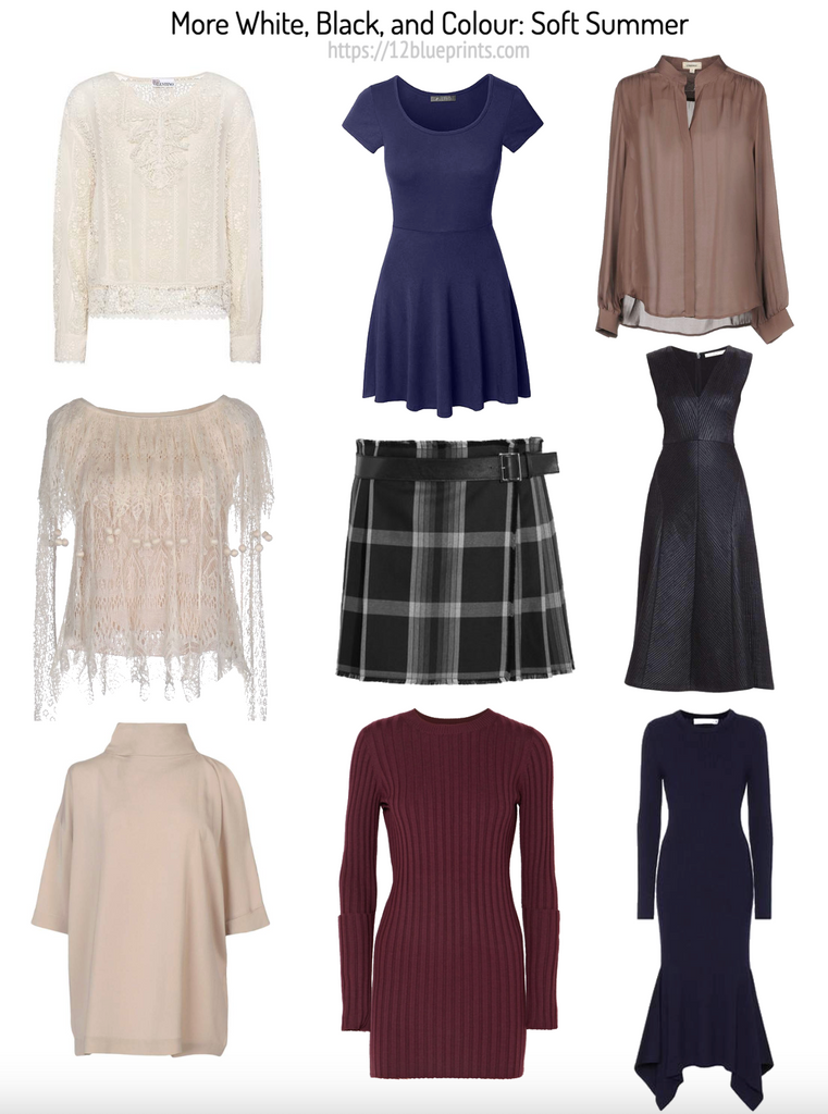
Shopping information: https://urstyle.fashion/styles/3641651
The white lace blouse may be more golden or pigmented or both than the pinker and grayer blouse in the Whites for 12 Seasons image in Part 1, and represents Soft Summer white well. Your palette may have different whites, which is fine. If you feel the colour should work but can’t find a match in the palette, hide the white strip. Now how does it work? Can you make nice combinations? Do the red strips look about right, without the warm tones looking suddenly brick-like, or the cool reds looking bluer?
Second item, the slight pinkish tone might be considered a nude pink beige and looks attractive with this colouring. The third item shows the same sort of warm tone with a golden property, with pink tones more discernible than green ones, a feature of the cooler neutrals of Summer.
Second row, blue violet is flattering for all Soft Summers, excellent for men, and a great black alternative. Next, the plaid skirt shows greener tones in the dark gray as Autumn enters the palette, with a gradient of light medium and dark grays woven into the plaid. Gradients uphold the gradual colour transitions that are elegant for Summer, here in an inspired version of contrast adapted for Summer. Beneath is the soft berry-burgundy sweater. The ribbing adds the bit of texture that Autumn loves in the soft darkness that is a hallmark of this Season.
Third row at the top is a pink coffee colour in a softly sheer colour, like pink sand, also a beautiful colour in the hair or as a contour in cosmetics. The colour of the dress below is hard to define. We see dark gray, like pewter, with tones of blue, teal, and violet. This effect is magical for Summer, embracing the ability of Summer colours to do and say more together than apart (opposite to Winter).
The final item is red violet relative to the top of the centre row, and darker. Soft Summer wears fairly high darkness with ease up to this point. What may be an issue is brightness. The metallic pewter sheen of the dress above and this matte textile help to keep colour soft and yet look surprisingly colourful (and colourful enough) when worn by this person.
True Spring
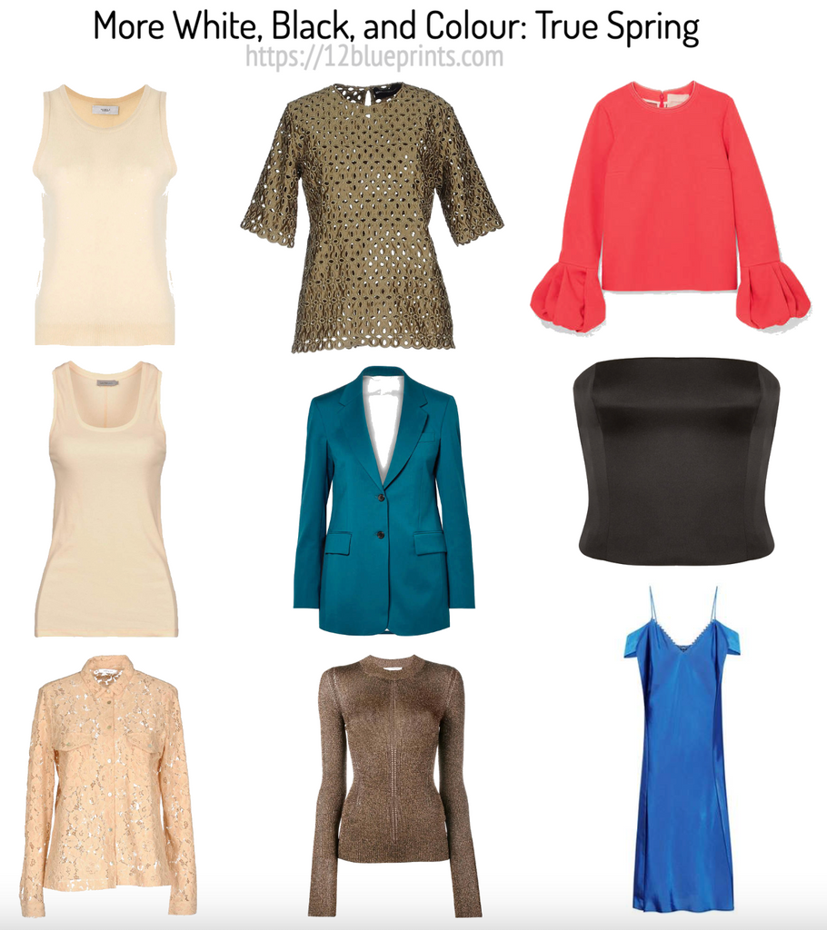
Shopping information: https://urstyle.fashion/styles/3640407
What’s Spring’s magic? Not contrast, or texture, or peace. They’re available as they to all Seasons, but what brings out the amazing is colour.
White alternatives are shown in the first row, with versions of warm peachy ivory, and golden beige in the second item. The blouse at the end might act as a white alternative or wardrobe neutral, in an eyelet that interprets the Spring effect of buoyancy by allowing air and light to move through the fabric.
In the centre row, the blouse at the top might be an example of Spring khaki, a richly pigmented olive green, again with the beautiful feature of air and light moving through. Interest is added with the skin tone creating a print effect with the fabric and colour.
For both warm groups, Spring and Autumn, dark turquoise and teal may be a version of navy blue, here in a jacket that might be as dark as True Spring would wear. Pairing the jacket with one of the warmer colours brings warmth to the skin tone and creates the contrasting effect that is the focus of this 2 part series that began with black and white. The smooth fabric creates reflects light in a way that is flattering for Spring.
The third item is medium dark brown with golden shimmer, giving an impression of sunlit sand. For a Season where darkness may be hard to control, this is comfortable darkness that combines with light colour to meet the contrast level of the person without exceeding it.
In the third row, among the darker red-orange tones in the palette is a version of coral in the blouse, with a lovely effect that the wrists, like little parachutes, that enhances the lightness of weight of these colours. Next is the dark brown corset item to illustrate one of the darker browns that may be found in some palettes. Below is an example of dark blue in a palette that has fewer options in blue, this one only medium dark, consistent with the light to dark range of the palette, and a colour that would be excellent as blue jeans.
Light Spring
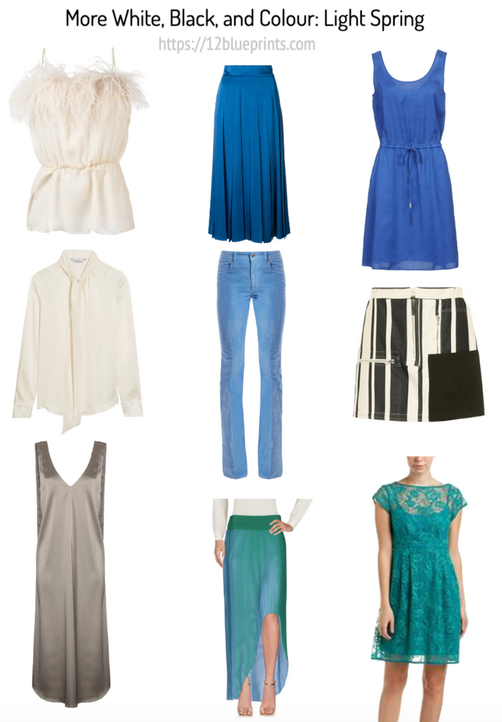
Shopping information: https://urstyle.fashion/styles/3640663
Light Spring is Spring with Summer, mostly Spring. Beginning with white alternatives, we see the peachy tones in the item above and more yellow or creamy tones in the blouse in the centre. These whites are similar to True Spring with less pigment, in keeping with the softness contribution of Summer. The dress at the end is silvery beige, a beautiful neutral for Light Spring. The colour is based in beige rather than brown, and repeats many tones in the natural hair colour. The colour is far enough from white to create definition, great for accessorizing, a versatile colour that could be an eyeshadow or a man's tie. In the shine, the dark areas are not much darker than the main colour and the light areas are not much lighter, an effect that works well across the Summer-influenced Seasons.
In the centre row, the skirt is an excellent version of navy blue. Blue is attractive for Light Spring, speaking to the bit of Summer in their colouring and good for creating contrast with white. In the jeans below, the textile looks modern and has reflective properties, giving a mermaid quality to the blues and greens in the colour. The magic of the Light Seasons is the meaning they give to lightness of colour.
The turquoise in the skirt is an excellent black alternative, here in fabric that appears to change colour with the movement of the body, creating the flowing air and water sensations that Spring and Summer express so well.
The dress at the top of the 3rd row is a soft yet bright darker blue with violet tones that might be called periwinkle, in a lightweight gauzy textile. The skirt below is similar to the bubble print skirt in Light Summer, here in warmer white and lighter brown. The pocket patch looks fairly dark but in a small area, it provides a small area of higher contrast without becoming the focal point of the appearance. Spring easily finds a home for innovative or unexpected effects when the quantity is controlled, adding an element of fun compared with the same skirt without the patch. The lacy dress at the end of this row is a similar colour as the skirt to the left, in the blue greens that would be my choice if I were dressing Light Spring for an event.
Bright Spring
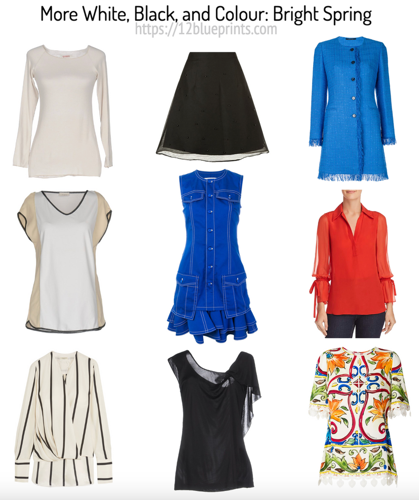
Shopping information: https://urstyle.fashion/styles/3640673
Bright Spring is the natural colouring group that blends Spring with a smaller proportion of Winter, widening the light to dark range to extend closer to white and black.
In the first row, we have white alternatives or ways of wearing white. First is a slightly warm white for this neutral-warm Season, that appears a combination of light gold and silver, an attractive effect in fabric, colour combinations, or metals. The next item has a clear, warm white in the front centre panel with peachy beige side panels, and the perfect use of black to outline edges without adding significant darkness or weight to the item. The blouse at the end is another example of restrained use of black in a warm white background, keeping the overall effect crisp but overall light, bright, and warm as this Season is.
Black alternatives are shown in the centre row, with a variation of the darkest brown at the top for a palette that becomes quite dark in the neutral tones, and less so in the colours. The sheer overlay in that skirt adds the sense of lightness and lift compared with how the skirt would look without it, using style to enhance the Spring impression. The dress below is a beautiful bright blue, a colour that Bright Winter could wear just as well, with silver buttons and white stitching that suit both of these Neutral Seasons.
Below is a version of black, a cooler colour than the skirt at the top that takes a step back from pitch black, which you may see in the pants of the model wearing the red blouse in the third row. Sheerness of textile and floaty details on the shoulder are gorgeous for Spring, how the flattering effect of transparency might work with black. If this style is not ideal for your body type or lifestyle, this same dark charcoal colour could easily work in pants or a full length dress. Some Bright Springs manage darker colour near the face more easily than others and the option of lower necklines or a piece of reflective jewelry is always available.
The bright blue at the top of the 3rd row is gorgeous for this Season and although the textile is matte and woven, the colour has enough saturation to maintain the high brightness. The fringe at the cuffs and hem allow light to pass and add a youthful effect. Next is the red blouse that contrasts well with the black pants, although the black might seem a little severe or bulky in the full length version. The sheer fabric and the bow detail in the sleeves are lovely additions.
The final item is the printed blouse, featuring many attributes of Bright Spring. Several colours at once is lovely on Springs and can be more interesting than two solid colours on their own, as we noted earlier with Autumn. The warm white background and generous use of orange, green, red, and blue create warm to cool colour contrasts for this Neutral Season. As in the first row, black is used to outline shapes, like threads of black, keeping the effect crisp and delicate. The four corner design organizes the overall effect and adds Winter symmetry for an artistic multi-coloured combination. The medallions around the hem add movement and fun.