
In Part 1 of 2, we look at examples of white and black for the 12 Seasons (groups of natural colouring), followed by a closer look at each Season individually.
A viewer said, "I love the combination of black and white in clothing but it doesn’t seem to look right on me. Is there another combination that could be worn that is close as possible to black and white for each Season?"
I asked myself what it is about black and white that is appealing. It might be the crisp, formal effect, like a tuxedo. The high contrast of light and dark extremes can look somehow special and can be meaningful and elegant on Winter, but the viewer’s question is insightful. If our own colouring doesn’t reach those particular extremes, then wearing them doesn’t play to our colour strengths. The next question is, what would those strengths be?
I took two approaches to answer the question. First, the basic approach of the white and darker neutral options for each group. Second, recognizing that black and white are not only extremes of light and dark. They’re also extremes of cool and clear. That’s three extremes. For Seasons that are not flattered by these, alone or together, which colours or combinations might create the effect that looks special for the person wearing it? The other title of this video might have been, Make Your Own Kind of Music.
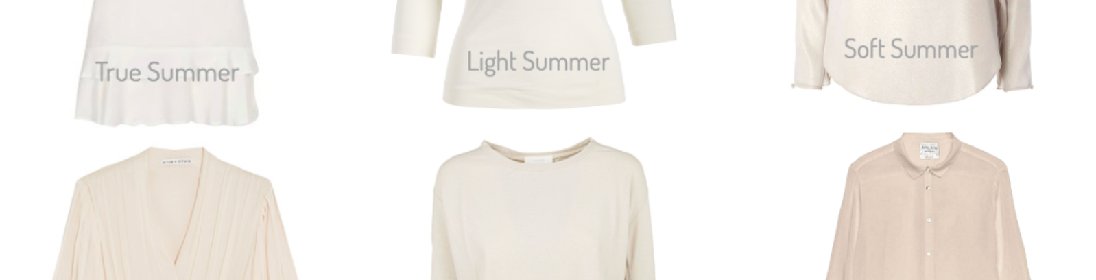
Whites for 12 Seasons
Next to the face, white is uplifting, flattering for the complexion, fresh and rejuvenating for the presentation, and amazing with silver hair. Every Season has several white options. If you picture any of the items below as a screen of thousands of pixels, the whites could all take part as the Season’s white. Don’t feel committed to one version of any colour, especially neutrals, or discouraged if they’re not identical to your palette. They don’t need to be. You want them to share enough to work with the other neutrals and colours. Harmony is about agreement.
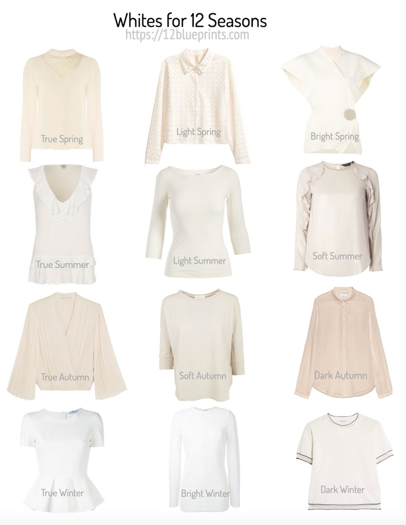
Shopping information: https://urstyle.fashion/styles/3640371
In True Spring, the ivory peach yellow component is visible. By comparison, the warmth of True Autumn appears golden. True Spring is brighter (more colour pigment relative to soft gray) than True Autumn, which is softer. Light Spring is lighter, with the same ivory, although fewer yellow warm tones. Bright Spring colouring combines some Winter bringing white nearer to pure white, still with enough pigment to see the touch of ivory and also a yellow green cast that is part of Spring-influenced colouring.
Summer is soft, like Autumn. Summer light tones are pastel, meaning more pigment and more gray relative to the pure white of Winter, a concept that applies equally to white. True Summer white could be called eggshell or off-white. Light Summer is brighter, meaning less gray, and the warmth is more like Spring above than Autumn below, like vanilla ice cream. Soft Summer has warmth too, which is more Autumn than Spring, like clamshell.
Autumn colours have softness and darkness. True Autumn warmth is gold, a darker softer colour than Spring yellow. Soft Autumn is the lightest of the Autumn trio, with Summer influence, and white is soft. Comparing Soft Summer and Soft Autumn, Soft Summer. might appear relatively pinker and Soft Autumn greener. Dark Autumn white is warm with gold and may have a red tinge, like white in front of a fireplace, and red compared with Soft Summer pink.
White for True Winter is white, like igloo, white plus nothing relative to the other 11 groups. In Bright Winter, the brightness appears as a slight illumination from a touch of Spring yellow. Dark Winter has Autumn within it, bringing back the red-orange tinge that’s also in Dark Autumn, to a lesser degree. Dark Winter white on its own might not appear this warm unless it were place next to True Winter white and the softness and warmth would be more visible.
Black or Alternatives for 12 Seasons
This image shows examples of black or a functional darkest neutral for the Seasons. Seasons who are not flattered with black have several dark neutral options, some darker than this, but we're keeping a step back to see the colour effects.
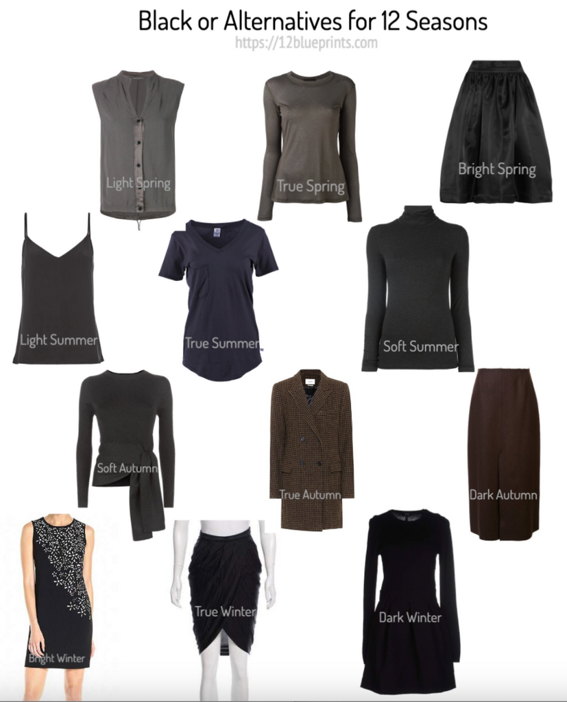
Shopping information: https://urstyle.fashion/styles/3640387
Beginning with Light Spring, this may be an example of the darkest grays, a step lighter than True Spring and also cooler, meaning bluer. The colour is not as pigmented as True spring, with the presence of Summer having a softening effect. Comparing with Autumn, this gray is lighter and less red. You could almost slide it into the Summer row if it were not so yellow green.
In True Spring, the yellow green component intensifies and the darker gray is greenish, like a Spring khaki. Neutrals may go a step darker as, or more depending on your palette, but for most True Springs, this darkness level may be good to create contrast in outfits without exceeding the natural contrast of the person or causing the detracting effects of dark or cool extremes.
Winter plays a part in Bright Spring and dark colours shift darker and more charcoal. You may see similar yellow green tones in True Spring, fewer because Winter-influenced neutrals have less colour pigment.
Light Summer has a darker endpoint than Light Spring and creates higher light to dark contrast. Too much distance between lightest and darkest may look abrupt or severe, and the person can get lost in it. This example is a soft neutral brown, with a hint of the green tones of Spring, since Light Summer is a Summer-Spring blend, more Summer.
True Summer is a cool, blue-based type of colouring. The gray T-shirt is darker than Light Summer, a raincloud blue gray and may have a violet tinge. The Season also has grays that may be blue-greenish or pink-violet-ish.
Autumn appears in Soft Summer colouring, adding darkness and softness. The example shows a cool neutral brown gray, replacing the yellow of Spring with the gold of Autumn.
If we compare Soft Summer with Soft Autumn, we see that Soft Summer is pink relative to Soft Autumn. Soft Autumn is a touch lighter and greener, in the same effect we saw with the whites.
In True Autumn, golden warmth and increasing darkness combine in dark brown. This coat is a checkerboard pattern and both darker and lighter browns are variations of green-gold, most attractive for this colouring.
Dark Autumn black is darker and may appear simply black, a warm and slightly dull black compared with pure black. A reader asked how to choose from all the cream and black combinations we see in stores. As with any colour or combination, the answer depends on the colouring of the person wearing it. The person who will have a beautiful silhouette and overall proportions with black in the lower half may not be flattered by warm white near the face. Dark Autumn and Bright Spring may be the best options, with their ability to wear black and warmer whites with relative ease.
True Winter black is very dark and may have a slight purple or a red violet tinge. A greenish tinge is possible as well, as the gray dress in the panel below suggests. In Bright Winter, the colour is not quite as dark and may have a slight yellow green tinge, like the pigment in Bright Spring. The sparkles lighten the effect around the face, which is beneficial for Bright Winter in whom pure black, even their perfect black, may be heavy under the face for some, while others wear it with ease. For Dark Winter, the colour is very dark with a slight red orange tinge, as in Autumn, less for this Winter group.
True Winter
Beginning with True Winter, which sets the baseline for basic pure white and black.
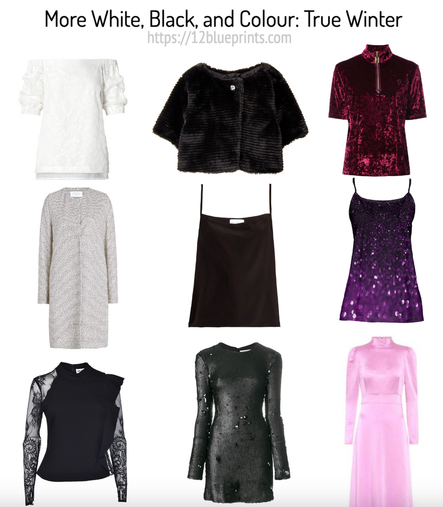
Shopping information: https://urstyle.fashion/styles/3641888
White may have a little colour reflection, often from lighting. Neither yellow nor orange appear in the folds of the fabric, and a touch of pink is possible. The light gray coat is an example of the warmer-appearing neutral tones, cool relative to the other 11 Seasons. The deep black blouse with silvery lacy sleeves is here to say that in the black and white combination, the light item could be silver or diamond.
In the centre row, the faux fur shrug is a purple brown, an example of the dark brown that resembles Oreo cookie. If the button at the top is gold, it could be changed to silver if worn by True Winter. Gold on True Winter may appear dark or inexpensive and silver is better next to this skin tone, or these skin tones, of which there are many in each Season. The tank top is a similar colour but darker and an excellent black alternative. The gray dress, more armour than sequin, is a medium-dark metallic gray with a greenish tinge.
Contrast is a more special effect for Winter than black, and colour goes places for everyone. I wonder if many Winters would agree that black isn’t their best colour unless the garment is special. Black is easy. If I had a gorgeous colour option, I’d choose it every time.
In the third row, the fuchsia velour is a colour family that has versions in all Winter palettes. When I placed it with the warm strips of the Dark and Bright Winter palettes, the effect was awkward, and yet easy with True Winter as a dark fuchsia. Like the faux fur cropped jacket, texture adds an uncommon element for the colour and Season. The gold zipper is not ideal for True Winter and the shade of gold may not be ideal for the garment.
True Winter is magic in purple and I love the darkness at the top of the sparkly cami, with the lighter effect and sequin effect along the lower edge. The iced fuchsia of the full length dress may be the lightest of the pinks, a striking colour. Accessories might be black to create the desired contrast or the colour could be worn in smaller area, ideally near the face.
Dark Winter
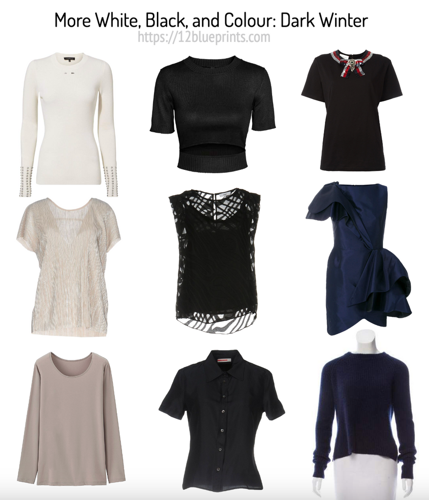
Shopping information: https://urstyle.fashion/styles/3641231
The white sweater may be the upper limit of pigment for Dark Winter white, but it’s the right kind of pigment and might qualify as light gray, the next darkness level from white in the palette. An onlooker might call Dark Winter pure white, rather than ivory or off-white, because it has a bleached impression that only Winter whites have, with little or no colour is visible within the white.
Next is an icy beige with an excellent textured shine, almost a gritty texture, followed by another version of gray. Next to lavender gray, this might look more yellow. The opposite may happen when Winter people wear Summer’s lavender grays, the person looks yellow because their natural yellows are of higher saturation. The idea is to look like who we are, not altered in any way, and the same for the colours we wear.
Next row, black with the same orange tones that we see in the white sweater. Dark Autumn black looks much like this. The sleeveless top is very dark and the lace has Autumn substance, a woven effect like black basketweave. With light skin tones, contrast comes from skin. With dark skin tones, jewelry and the brilliance of teeth and eyes create the contrast, a striking effect, along with the beautiful skin tones showing through the lace. Next is dark gray in a linen textile, a step back from full darkness in an everyday fabric that could easily be cotton.
In the 3rd row, the warm black sweater with the neck tie detail elevates black by adding exaggerated effects to the point of slightly weird. This type of detail can be excellent for Winter, depending on the person of course, perhaps with more restraint for the natural quality of Autumn. We might ask, when does credibility become costume? I find this intriguing and beautifully decorated with a good sense of enough. Metallic textured ribbon and contrast in the ribbon are good choices. The dress is next, possibly my favourite colour for Dark Winter. Below that is a jewel-toned purple in which the jewel tone would be visible and with this colouring, the item would not look black.
Bright Winter
Neutral Seasons, meaning a blend of a warm and cool parent, have wider warm to cool ranges compared with True Seasons, giving them a few more choices in neutrals. Bright Winter is Winter with Spring, more Winter.
.
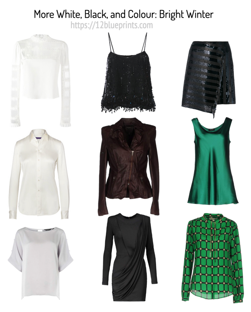
Shopping information: https://urstyle.fashion/styles/3641549
The first white is cooler and combines white with textile where both colour and fabric reflect light. The second, warmer white is as warm as this cool-neutral colouring might wear, and possibly too warm for some members of the Season. The light gray at the bottom is a matte fabric and qualifies as an icy gray, very light with no particular colour component.
The centre row shows a beaded black cami, where the shine and movement of the beads is great for Bright Winter, same with the sequin bands in the skirt to the right, giving the same impression of movement and sparkle. The reflection of light and the speed with which light moves across the textile look great for this person.
Dark brown is gorgeous on Bright Winter. This purple brown jacket is quite dark but not black, the red-violet often repeated in the highlights of the natural dark brown hair colour. Below that, the dress is a black alternative, not as dark as black and a good option for the many Bright Winters who may be overtaken in solid black, especially in large area near the face. The cami at the top helps by reducing the area and lowering the neckline, whereas the dress manages black by taking a step back from full darkness.
For an event, I’d choose a colour for everyone including Winters. Dark turquoise in the cami is excellent in smooth, shiny textile. In the blouse, we have rainforest green in a crocodile print, with cool beige in the corners of the pattern that’s inspired, like green gold. The design has more colour than black area, a brilliant assignment of colour in the pattern.
This brings us to the end of Part 1. In Part 2, we’ll visit the 9 Seasons for whom other colours make a more positive statement in their appearance than black and white and look at colours and effects that sing for each Season.