
In this 2-part series, we look at choosing neutrals that look great with your own natural colours.
Wardrobe neutrals might include beige, taupe, and the many shades of gray from near white to dark charcoal. We’ll look at the guidelines to follow for your group of natural colouring, called Season, and the first two questions I ask myself when working with neutrals (and they’re different for cool and warm tones).
Appearance choices are often the first way we communicate with others so it’s a place I want to have a high level of literacy. I also think of appearance as a kind of artistry, like choreographing a dance. We learn the steps of the dance first and then we begin connecting them together to create a beautiful and meaningful presentation.
I interpret fashion or wardrobe neutral as ‘doesn’t contribute specific or additional colour', like the trunk of a tree for example. The bark provides background, context, and structure, essential parts of the presentation without adding another colour.
Neutrals have less colour pigment which gives them some flexibility with other neutrals and colours, but we want them to have a connection with the colours in us and our overall presentation. The key is that the colours are the source for the neutrals, giving them a reason for being together rather than the impression of appearance as a random collection of parts.
Fashion or wardrobe neutrals are different from Neutral Seasons. Neutral Seasons include colours that are both warm and cool, or have a range between warm and cool. A True Season, like True Summer, represents the colouring of a person whose colours are fully cool. Each True Season has 2 Neutral Seasons, in which the colours have influence from a blend with another Season. For example Light Summer blends Summer with Spring, mostly Summer.
Today, we’ll combine the trio of 3 Summers or 3 Winters together. Neutral Seasons have slight differences in their colours and neutrals from their main True Season, but overall, they share more than they differ in their colour properties and the same guidelines for choosing them applies.
Gray scale = light to dark range = value range
The colour or neutral that looks great on everybody doesn't exist. We wouldn’t call the furniture store and say, “I need furniture and I’m going with gray so deliver anything you have. Gray goes with everything”. We know we have to read the room and choose the right gray. For our best appearance, we're the room.
Having less pigment makes them more flexible as the backdrop for the colours we wear. The same gray couch might work well in three rooms painted similar blues, like summer sky, lake blue, and Atlantic ocean, which is why we're grouping the 3 Summers and 3 Winters together. Lagoon turquoise or midnight sky may be more flattered with a different gray.

Photo credit: Ivy Son at Pexels
In Part 1, we focus on the basics of choosing neutrals for the cooler Seasons, Summer and Winter. With cool colouring, neutral often means gray, or a term qualified with gray, as in gray-violet. Cool Seasons have their beige, khaki, and brown tones, with a narrower selection than warm Seasons, and they might still be described as predominantly gray.
Spanning ice, dove, raincloud, asphalt, pewter and black, we could call the image above a gray scale. Each Season has their own light to dark range and if this picture were the grayscale of a Season, it might bracket very light gray to medium dark gray. For another Season, it might extend all the way to pure white and the darker side would continue to reach pure black.
Colour palettes
I appreciate that hearing, ‘You’re this Season and here’s your palette of 65 or 90 colours!, and now go shopping and make all these changes.”, may feel like, "Where do I start in this journey towards a person or closet I can barely imagine?"
I’m not a colour theorist or have better than average colour vision. I don’t need to and neither do you. We have a great system, with colour palettes that accurately represent the colours in human beings and organizes them into groups, with a process for colour analysts to determine who fits into which group.
Being able to hold my colours in my hand and compare them to things I buy gives me a much better way to think about choosing colours. If we were to pixelate the colours in me, this is what we'd have.

Source: https://nducolors.com
I use the Sci\ART-based colour palettes because they tick all those boxes for clients and colour analysts. You’ll find them at TCI and NDU, both offering gorgeous products and selection. (Other groups may also be great, I'm simply not familiar with them.) As a side note, you can purchase your neutrals and colours as fabrics sets in the Shop in this website. With neutrals, this is the one concrete tool that probably helped me more than any other.
4 Season Neutrals 1: Summer(gray-violet)
We find a lot less pigment in Winter neutrals than their colours compared with Summer where the distance between neutrals and colours is smaller, with soft colours and neutrals that have just moderately less pigment.
Another way to say this is that Winter neutrals are more likely to have no visible colour compared with Summer neutrals, which do have a recognizable colour component. The reason is that Winter colours are highly pigmented so the brain finds balance in neutrals that are very low in colour pigment, whereas in Summer, colours and neutrals are closer together.

To place colours into Seasons, I begin with two questions, whether colour or neutral.
First, is it within the value range of your Season palette for that colour family? A colour can often be eliminated with that alone.
Second, for grays, can I see a colour in it? If yes, it may be a good choice for Summer. As your eyes sensitize, you may perceive colour in the Winter neutrals coming up, but relative to Summer, you might agree that it’s less obvious what the colour is.
For the item above, it is within the value range for Summer and I see colour in the gray. I feel confident what the colour is: gray violet, ash violet, amethyst gray. I find a very similar colour in the True Summer palette and feel confident that it would be a good choice.
4 Season Neutrals 2: Summer (light gray)
When there’s less pigment, it’s harder to tell the colour. This could happen when a colour is very light or it may be may be a Winter neutral that really does have less pigment. The situation is similar when a colour is dark because the darkness becomes more important than any pigment it may contain.

With this tank top, I look to see if it’s in the light-dark range for that shade. Yes, in both Summer and Winter palettes.
I’m not sure about the amount of pigment, or which colour it might be. The longer I look at it, the more I see blue and possibly green or violet in the gray, but a single swatch in a Winter palette could look similar to this.
If there were white highlights reflecting from the fabric, this might bring it nearer to Winter, a metallic effect, like aluminum or stainless steel. However, Summer could have a diffused silvery shine and we couldn't eliminate a Season based on shine. In this matte fabric, the overall impression is nearer to Summer.
If we take another look at the Summer and Winter palettes, we might find a closer match in Summer. In Winter, the palette version seems yellower or greener or more different from the garment.
4 Season Neutrals 3: Summer (with black&white)
If this top were an investment item, we might want more confidence in choosing it for Summer. Our next step is to compare it to colours we're certain are Summer or Winter.
Comparing with white can make the colour component in the neutral more visible. I prefer black and white together, because white reflects more light and is more influenced by the colour of surrounding light.

If we replaced the top in the outfit with the gray tank top, we might notice that the black pants become dominant in the overall look, and the gray would have little presence. Would another fabric, like satin, be more Winter? We'd have to see before deciding but the gray would probably still be Summer, as it would if the fabric of the top were the same and the pants were black denim. Every Season wears matte fabrics fine in the right colours without altering the colour relationships.
As we mentioned at the beginning, the colours in a Season are the source of its neutrals, which gives an organized and unified impression to our presentation. In the colour chart in the lower left corner, we see the small white circle in the upper L area showing where the colour is positioned. It's near the grayscale, the white to black edge on the L, but still some distance away, indicating that some colour pigment is present.
We could find many Summer colours in the moderately pigmented levels near the middle of the chart, and Winter colours in the highly pigmented colours further to the right. Having the similar source colours for Summer and Winter makes sense, since both are cool groups.
Grays are adaptable and if a colour works for True Summer, it may work well for one or both Summer Neutral Seasons. For this item, Light Summer seems a good option.
4 Season Neutrals 4: Summer and Winter
Now that we know some basics, let's look at more Summer and Winter grays in a wider value range.

In the first column on the Summer side, we have a gray with a distinctive blue-violet cast at the top, followed by two with a sandy pink wash. These are comfortably Summer.
In the second column in Summer, the top two grays are similar. The upper one with the ruffle straps has a soft or matte reflectivity and seems to belong with the rest of the Summer group. The next one down with the V-neck is lighter or has a whiter reflectivity and might be a colour that could work in Summer or Winter. That said, in this Summer group of six, it would be the one that seems least belonging or would depend most on the other colours in the outfit to work for Summer.
For the pants, we recognize the light pink-gray wash that we find in Summer. They balance with the soft white blouse pretty well, compared with the more abrupt combination with black. Compare this with the relationship between the pants and black shoes in the first item on the Winter side. The impression is more balanced and cohesive in Winter.
Next item in Winter, the graphite gray sleeveless top reminds me of asphalt or iron. It is outside the value range for Summer and gives a solid or dense impression that might seem stark or heavy, including for the darker Summer called Soft Summer.
Next, the silvery gray-pink tank top has the whiter reflectivity that cooperates with Winter. There is a pink-silver tinge and the shine that could be interpreted as pearlescent, but I find better balance in an outfit with the graphite top above than with the pants in the Summer group. The pink tinge in the top should help it work in a Summer wardrobe but there’s not enough of it, plus it's too light for the pinkish greys in the Summer palettes.
At the top of the far R column in Winter, we have a basic gray T-shirt. By increasing the darkness and reducing some of the colour pigment, the balance with Winter is better, although in this group of six, the blue effect may work better in Summer.
The next two items for Winter, the cami and the ruffled skirt have a colour component that's hard to identify, which is rarely the case for any Summer, and these look more like Winter metals or minerals than Summer feathers or sand. These analogies are not data-points for putting colours into Seasons. Instead, they help us visualize a big picture or how a colour might participate in a whole. Every colour we add to a painting or our presentation has a compounding effect with all the others but it’s easy to miss if our attention is on individual details. Ultimately, the overall impression is where the value of colour harmony in appearance lies.
4 Season Neutrals 5: Summer (with jeans and gloss)
Back to our gray tank top. We're looking at a simulation of fanning our Season palette open all the way and placing it on the garment. Once we've done the fly-over impression and found it agreeable, the next step is to direct our gaze to specific colour combinations or relationships.

On the Summer side (Left), the gray with the jeans, the gray with the lipgloss, the pairs are peaceful and balanced. The colours in the combination show up well and evenly, and cooperate in enhancing one another.
With the Winter colours (Right), looking at the jeans with top, the lip colour with the top, I have the sense of the tail wagging the dog (the tank top is the dog). I’m still choosing Summer for the tank top.
About the Winter lip colour, you may be wondering if a more sheer version would work better for Summer. Diluting the pigment density would be helpful, but transparency is not a way to measure colour. Adding gray would soften the colour in Summer's way, but transparency by adding a colourless material may not be enough to subdue the red, blue, and darkness into the realm of the soft pink of the Summer shade.
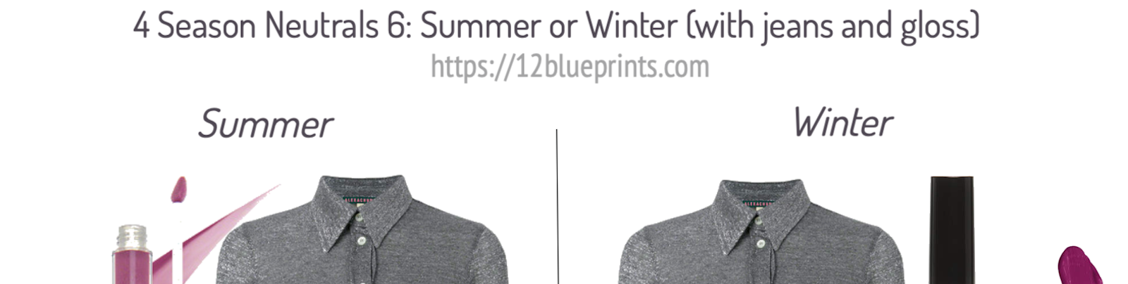
4 Season Neutrals 6: Summer or Winter (with jeans and gloss)
Once a colour or neutral meets a boundary between Seasons, whether value, brightness, or warmth, it may not be as easy to place in a single group, which may be an advantage. The top below is within the light to dark boundary for Summer and Winter, although reaching the darker edge of Summer. It doesn't have visible or obvious colour pigment, also making it a good contender for both groups.
 Shopping information at URStyle: https://urstyle.fashion/styles/3703624
If I saw these combinations on a Summer woman and her Winter friend seated at a table in a restaurant, I think I'd be fine with both in terms of balance and the colours working together. The Summer colours are present and appealing, and the Winter jeans and gloss are not draining colour from the top.
In this matte textile, with a marled effect and not reaching the sharpness or density of ice, metal, asphalt, graphite, coal, I might imagine Summer better, but not enough to matter. If there were a detail in true black, often found in synthetics like athletic wear, or a shiny element, which may be tarnished teapot rather than sequin or mirror, these also bring the item closer to Winter. If a higher level of precision were desired, trying a few more colour comparisons in person with the garment would be the next step.
4 Season Neutrals 7: Winter (with jeans and gloss)
Once the colour moves outside the value range of Summer and contains little or no colour pigment, we may be in the realm of Winter. Notice the position of the marker in the colour picker chart. It's way over in the grayscale and almost at the bottom. Winter seems a good choice for the jeans, the shoes, and the cosmetic.
With the Summer outfit, the jeans are not cohesive in the look and the lip gloss is ineffective or faded, as if I have to remind myself to notice it.

Anyone notice that as we get nearer the gray scale, as with Winter neutrals, grays become yellow or greenish? It’s the same source colour, a red-violet that we know in Winter palettes. I'm not sure if that's some relationship between red and green, but I see it in all Winter neutrals and Winter people, depending on the individual skin tone. I learned to disconnect warmth from visible yellow in colours or surface skin pigmentation (or brown eyes) many years ago.
4 Season Neutrals 8: Winter and other grays
In this panel, we'll look at more Winter grays in the top and bottom rows, asking whether the items in the middle row might work in a Winter wardrobe.

In the top row, we saw the first item earlier in panel 4. I wondered if the light reflection and the closeness to white might be more belonging in a Winter group and yes, I do prefer it here better than with Summer, as in that previous picture.
In the middle row, the first item is the light gray racer back top that also saw earlier, also in panel 4, where it was placed with the Winter group. When the gray or the reflections are very near white, the impression is metallic, the pink is so subtle that many people might see yellow or green rather than pink, these may winter be Winter clues. The item appears to work here with Winter.
Second item in the middle row, the cowl neck has more visible pink, with a version in Summer that has similar tones. Combining it with other Summer colours creates balanced outfits, while in combinations with Winter, the Winter is dominating. I would choose Summer and wish the item were a step darker and had more colour pigment.
In every video, we meet the limits of my abilities with images, meaning the flutter neck blouse, third in the middle row. At first glance, the colour looks like a mushroom-ish brown. I perceive neither pink or blue for Summer, which I might expect at this value level. There is an elephant gray quality and green cast that resembles Autumn or olive, but earthy isn’t right, I don’t sense muted red-orange or a desert colour. The green and yellow tones are hard to picture worn by a Spring, but we'd want to try it, as we might with Winter. Trying combinations with colours might suggest a fit with warm or soft groups, but this is an item I'd want to have in person to decide Season.
The cable knit sweater appears to have a touch of warmth as yellow or gold within the gray. We could say something similar about the tank top, third in the row above, but the tank top looks metallic and could pair with the items in the lower Winter row. The sweater may not balance darker Winter neutrals, and even less likely with Winter colours like dark fuchsia or bright blue.
In the lower row, we have traditional Winter neutrals with enough darkness, coolness, and pigment density to be convincing and logical within combinations.
Palette Comparison with Fabric
Let's finish with a real world palette-with-fabric situation.
I believe that fabrics can be dyed in colours that don't appear in human beings, one example being ultrabright colours. Another might be colours that don't contain each of the primary colours, red, yellow, blue, which I think human beings do, for example, an orange made of yellow and red only, resulting in a colour that looks artificial on everybody.

Fabrics may also be too shiny for the colour. The matte side of the fabric in the image above would belong with Soft Summer, but it has an extremely shiny metallic finish, despite the slight texture in the surface. As you may see in the lower corners of the image, the colour of the shine changes with the colour of light, as shine does, and the level of shine creates a distraction or separation from the colour.
In this exercise, we're practicing the idea of 'making an outfit', very useful if a palette doesn't have an exact matching swatch or we're having difficulty deciding from a single strip. Here, we have the strip with the most similar colour first, on the left, then a selection of reds, and then a selection of greens.
Between the two, I would choose Soft Summer. Neither Season has an identical match but the Soft Autumn version is more pigmented than the fabric. In Summer, the fabric or its shine are warmer than the second dot from the end in the first strip, but it's not unreasonable. We could slide the fabric colour into the strip and it would find continuity with the pinkish gray and sandy brown tones.
If we move to the red strip, the Soft Autumn colours seem too warm. As a lipstick, it might look orange. The two lightest levels are hard to see and blur or fade relative to the Soft Summer versions, where the sequence of colours in the strip stays together nicely. I can see the lightest colours with the same vibrancy as the darkest colours, and I could picture any of them as an elegant lipstick or together with the fabric as an eyeshadow or necklace.
The green strips create the same experience as the reds. The two lightest levels of Soft Autumn are hard to see relative with Soft Summer where they appear pigmented and in focus. In Soft Summer, every colour in the strip looks even and connected, with a reason for being together. In Soft Autumn, the two lightest swatches and the rest of the strip seem not to be part of the same colour collection. This is an illustration of why it's good to look at every colour in the strip, not just the single closest match with the fabric. You’re building a harmonious wardrobe and a harmonious You, and harmony means agreement between things.
I could easily imagine this fabric, along with its shine, as a lovely piece of jewelry, handbag, or sandal, a colour that every person in the Season might use in their own ways.
Neutral Gray Surface
A good set of working conditions makes a huge difference. For working with colour, I use a neutral gray tablecloth, and wait for a day with overcast daylight around midday to do my colour thinking.

Source: Dollarama stores (in Canada)
Neutrals are foundational colours, and like foundation make up, it's hard for an appearance to come together if the foundations are off. Having your own colour palette gives you an entry point into the world of appearance and gives you a centre to hang onto as the never-ending winds blow on by.
You can sort through the drawer of makeup you never use but don’t want to get rid of because maybe one day, you’ll have new info and it might be great. With your Season, you know what is true about your colours that will always true, because your colours won't change. Finding answers for questions so they stay answered makes for a quality day.
Next time, neutrals for the warm colouring groups, the 3 Autumns and 3 Springs.