Welcome to part 4 of 4 in the Autumn Progressions series.
The video is also here at YouTube.
Today, we’re looking at accessories to compare the 3 Autumn Seasons, Soft, True, and Dark. We’ll see earrings, bags, and shoes.
Why hair?
As a change from the palettes and for viewers without palettes or who may be new to the idea to see how the things we wear work together.
Your natural hair colour is among the top 3 most flattering at any age. For knowing Season, hair colour is the least useful information. The analysis covers the hair for a list of reasons, but it’s a huge part of our presentation and surrounds our face and eyes.
Why earrings? Hair is always seen together with earrings, as eye colour is with blush.
Why bags? For the many colours available. Shoes may be functional, while handbags can be so decorative.
Why shoes? Because they complete our appearance, like book ends. I select comfortable over memorable most of the time. The closer colours are together, the more the colours influence one another, making shoe colour more flexible, with less influence on the overall look. Natural hair colour is ideal for choosing neutral shoe colours.
We’ll finish by taking a closer look at transition pieces, on a walk that begins in Soft Summer (more Summer, less Autumn) and finishes with the Dark Winter (more Winter, less Autumn) neighbour.
Hair colour and Season
We may underestimate the beauty of our own hair surrounded by its own colours, often because we’ve never seen it.
Highlights and balayage can be gorgeous, but like curtains for a room, a print may not improve the room as much as a solid colour. Before choosing hair colour, give the natural colour a chance to be as gorgeous as possible. With solid chemical hair colour, we lose the unique reference of our natural colour, darkness level, and guide for choosing the highlight.
In each panel that follows, you’ll see average hair colours with accessories. These might be hair colours we see often, but the bell curve for hair colours in any Season is wide. For the 3 Autumns, natural, chemical, or highlight, colour is soft, warm, and brown-based. They all are at least medium in darkness.
Without that darkness, Autumn facial contours may become wide and flat in an effect that may not occur with Spring and Summer colouring. Season isn’t about what we look like; its basis is how our appearance, our own colours and shapes, reacts to colour. Shapes are relevant in the analysis because colour and shape are related. There’s no colour out in the world, it happens when light energy enters our eyes. An image appears on the screen in our mind, the objects of which have colours and shapes. Switch one and the other might change, or it might not.
Soft Autumn hair and earrings
Besides colour and shape, the third component in how we perceive objects is reflectivity. This applies to skin, hair, and what we wear.
Soft Autumn is a celebration of quiet reflectivity as much as quiet colour. This colouring is warmer than it is cool and the warmth makes for a mellow glow, with less of a dusty impression. As with every Season, when the same colouring wear it, colour looks full, rich, energized, and gorgeous. When people of other colour groups wear it, soft colours may appear faded and low energy.
Your colours apply to everything you wear. Soft reflectivity includes metals too, which may be harder to find. For a Season with almost no ceiling for number of colours together, coloured stones may be easier to find, and small bits of non-ideal metals less important.
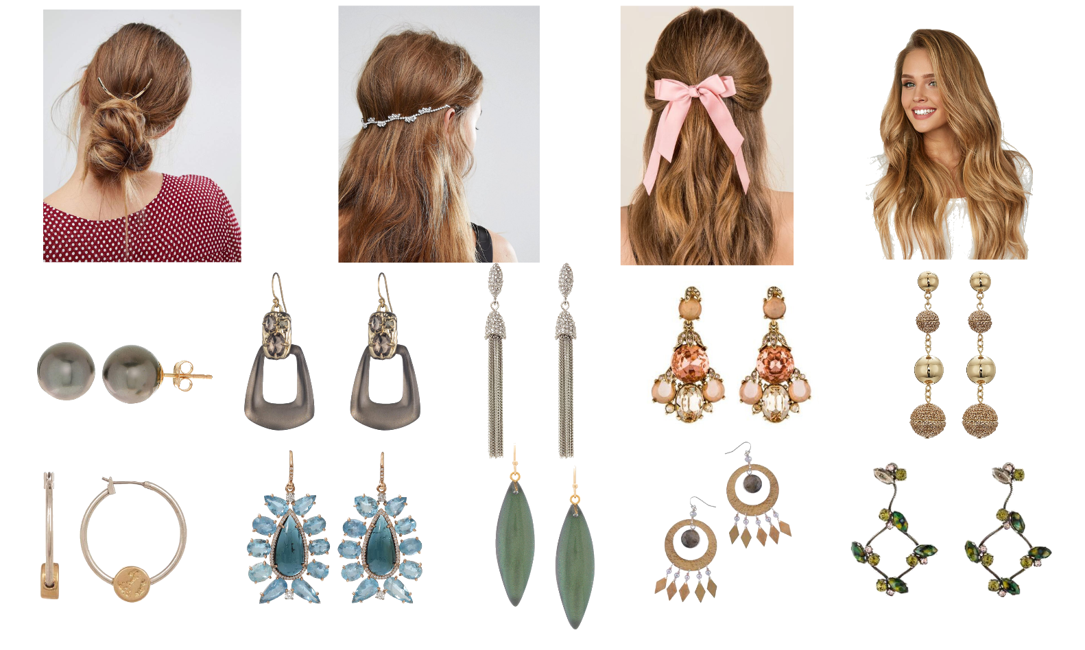
Once more, I realized how much of what’s available is too bright, too sharp, too yellow, too much. We wear it and in time find ourselves hiding behind it. Or as I do, wondering if everyone is under 30 with a big appearance budget. Finding out who we are in this world and getting everything else out of the way is like coming into the light. Maybe a little blinking at first but a much better place. As I chose, I kept in mind a picture of a plate of fudge, vanilla, brown sugar, and chocolate, imagining laying the earrings right on top.
 https://urstyle.fashion/styles/2907927[/caption]
Shopping information: https://urstyle.fashion/styles/2907927
This hair colour is sublime once we get competing colours out of the way. Surrounded by intense colours clothes or makeup colours, it may appear and low energy and lose the magical nuance Nature gave it.
Across the top is a range of colours, keeping in mind there are many variations. The base is often darker than these, often a medium-dark warm to neutral brown, with a good example in the True Autumn image coming next, placed there to compare with the other True Autumn colours. Depending on the darkness of the base, these might serve better as highlights.
If you prefer blonde, the colour on the right might be an example of honey or butterscotch, a dark blonde. The concern with blonde is that it’s too pigmented and too yellow, but reducing these may lighten the colour, which we don’t want. Preserve some of the natural darkness, the tendency being to go too light over time, causing the hair and face to blur together rather than the more flattering effect of hair framing the face.
I find a touch of coppery pink more beautiful, dimensional, and uncommon. Notice how it differs from a mental image of strawberry blonde, a more Spring effect. Soft Autumn hair is softer, browner, darker, and coppery rather than peachy.
Move your eyes around. Go from hair to earrings over and over. Don’t decide anything for 10 seconds. Just look.
Would there be other colours for earrings? Very much so. For these, I kept hair (and the plate of fudge) in mind. Factoring in our skin tone and eye colours expands options to include coppers, pewters, and many other colours.
Silver jewelry resonates with the smoky warmth in the colouring, smoke being like warm silver. Brushed pewters are gorgeous, in bracelets, for example.
Warm and cool together are also beautiful.
Anything seem out of place? They’re all so close that any pair would be lovely to wear, depending on the individual. Perfect or nothing is not how this works.
Perhaps the hoop in the lower left corner could have more depth or presence, but the longer I looked, the better it became. The metal has a soft reflection and as a variation of white gold, it has a lot going for it. The medallion seems to work with it, a good sign.
For the pair in the lower right corner, the wire may be dark, but Autumn manages darkness well. Scaled down to earring size for a woman with darker hair, they might become a favourite pair.
Colours don’t always need to be dialed back. Balance is the important thing. In Part 3’s video, I’m wearing gray eyeliner on the lower lid and black on the upper lid in a thicker line. Here, it’s black on both lids, thinnest line I could draw. This is better. (As a side note, I’m wearing First Aid Beauty Coconut Smoothie, a glowy moisturizer, in the spots where I’d normally place highlighter. Although not greasy looking, neither is it doing enough as a highlighter. I’ll go back to the Master Chrome, which you'll hear Jorunn and I discuss, along with eyeliner, in the podcast Episode 26 at Chrysalis Colour.)
As with prints and all apparel design, shape and size of earrings relate to body type.
True Autumn hair with handbags
 https://urstyle.fashion/styles/2907940[/caption]
Shopping information: https://urstyle.fashion/styles/2907940
The most often-seen base hair colour is a variation of warm, medium to medium-dark chestnut brown. For all three Autumns, the natural colour may have no apparent red tones and be simply rich, warm brown, and may or may not accept red in a flattering way. Hair colour is extremely individual in all Seasons are averages are best taken with willingness to adapt.
From L to R, #1 could be Soft Autumn’s base colour too. For Soft Autumn, the Summer influence is flattered when lightest and darkest colours are fairly close together, meaning highlights should not be much lighter than the base.
#2 is an example of more pigmented colour. For True Autumn, highlights should be warm and golden or russet. Avoid colour that is too light, possibly the most common direction that hair colour may take over time, particularly for this Season in which the overall impression may be lighter than the person actually is.
#3 has very slight green tones relative to 2, which you’ll see better in the Dark Autumn example.
#4 is the blondest highlight I would care for, and still find it a bit sharp. The image offers a sense of the darkness of the base hair colour.
With handbags, I’m actually less function and comfort-driven because there’s so much choice of colour and shape, to say something personal and artistic.
As you see, I appreciate red purses for repeating the lipstick. The effect is elegant and self-aware, discriminating, and seems so effortless that it was accidental. In the shop on this website, Rum and Raisin is the colour of the third bag in the lower row. Carnelian is the colour of the larger areas in the fourth bag in the upper row. Incredibly beautiful, both.
And as we said with Soft Autumn hair, I love copper penny pinks for Soft and True Autumn. Soft Autumn could easily wear the suede pink bag, top row, right side.
Any of these distracting? Let your eyes travel a bit. Humans can be so doubt-averse that we’ll grab the quickest, easiest decision to get rid of it. Try to ignore the models’ clothing colours. Take your time. Look at two colours at a time, go from hair to bag, hair to bag, hair to bag.
I wondered about the golden olive and came out on the side of Love. The warm glowing olive is so wonderful with the skin. Smooth, youthful hands are as good as as gorgeous facial skin.
The saddle bag, left in the top row, seemed too much, particularly compared with the bag in the lower right. I found it bright by a hair, perhaps better for Dark Autumn, depending on the particular colouring.
Do you know about the series of videos that Jorunn of Nordic Simplicity and I do at LinkedIn? If you’re on that network, visit Jorunn’s profile to see them all. True Autumn was done awhile ago, with Soft Autumn up in the next month or so, and Dark before we’re done. We look at business casual outfits for women and men.
Dark Autumn hair with shoes
Natural hair colour is one of the best ways to select shoes.
People see us head to toe. We would know if shoes were too big or small for body. We see big picture before details.
I like neutral shoes to be in the hair tones, for a bracketed, settled look, like a story with a satisfying ending. These shoe colours might also represent great highlight colours.
 https://urstyle.fashion/styles/2907983[/caption]
Shopping info: https://urstyle.fashion/styles/2907983
Dark Autumn is often a dark brunette who wears russet and auburn hair well, and much better than blonde.
Colour #1 one easily could be True Autumn base hair colour as well. As Winter’s colours influence this Season, hair can become very dark and/or cool, in a cool nearb lack brown.
#2 is an example of redder tones.
#3, shows the greener variations. At this darkness level, with a metallic reflection, the colour is bronze, as you see repeated in the logo boot.
The sandal is dark grey. I love it despite the zipper colour (light gold). The silver hair in this Season is often silvery to iron gray and looks great with shoes or coats in similar colours. I think of it as cauldron gray, a dull black, in this Season where greige is a better name for lighter grays.
Black works just fine, better as a warmed black, as with clothes or jewelry, or combined with a warm element like the wooden heel.
Are there any shoes you’d like to remove from the image, again keeping in mind that all these pairs could work? For me, it would be the ballet flats, first in the lower row, for being too yellow and light, and the flats third in the lower row for wishing they were a richer version of the same colour.
Transitions
Our last image takes us on a walk from the edge of Soft Autumn, beginning back with its cooler neighbour of Soft Summer, through the 3 Autumn groups, and leaving us once we reach Dark Winter.
[caption id="attachment_15006" align="alignnone" width="1420"] https://urstyle.fashion/styles/2908331[/caption]
Shopping info: https://urstyle.fashion/styles/2908331
First row, left side, #1, this is one of Soft Summer’s flesh tones. Warm mauve lipstick would look lovely. Cool terracotta lipstick might be good but the warmer side of Soft Autumn, as orange and Dijon yellow, are less easy.
Soft Autumn for #2 is almost too easy. Denim blue, Dijon yellow, soft browns, and a great not-too-warm background.
Colours of #3 are dark, yet soft. A few warmer oranges appear that were well-chosen for the print.
As Soft Autumn shifts to True in #4, orange is warmer (imagine it added to #2) and red is brighter. The mix of warm and cool with bright and soft looks interesting.
Second row, first item, #5, is soft and may look more so in sheer fabric. Compared with #2, this is warmer.
#6 is how I see ‘bittersweet red’. Fabulous with Rum and Raisin or Carnelian, this colour about halfway between these lipsticks.
The orange in #7 is spicier and brighter. We may see orange as warmer and more belonging with True Autumn, a reminder for me that we’re always thinking in terms of 3 colour dimensions. Warm and cool describe only 1/3 of a colour’s identity.
Item #8 has many colours that belong with True Autumn and could easily be worn by a person in that group as well. The bits of white are small, not enough to worry about.
Third row, first item, #9, is bright (meaning very pigmented), dark, and warm. Still with an earthy quality, where texture enhances the richness of the colours.
For #10, the sense is less of warmth and spice and more of cooling darkness. Interesting to present it in a soft fabric and ruffled design.
#11 is less Autumn-spicy again, with enough warmth, darkness, and metallic shine to be terrific for both Dark Seasons. I might see it better with cooler neutrals, but I may be getting possessive about an item I would like wearing.
#12 has tipped into Dark Winter. The rust is one of the colours I find iconic for Dark Winter (the colour of Slay lipgloss in the Shop on this site). The yellow is a colour we often see in the eyes and superb as an accent for those persons, without wearing a large area of the colour. We underestimate how much clothes intensify eyes and overestimate how much makeup does. Compared with #8 in which the white might separate from the print and the person, here the white is simply part of the design.
This Is Why We Do It
Others seeing the items above might say, “Of course, those are her shoes. Who else would wear them so well?”
Before reaching this place, we may be familiar with a situation that wasn’t fixing itself.
The old ways were letting us down again.
Setting boundaries is the last thing we want to do.
Slightly terrified, we imagine all the effort and the fallout.
People will act in new ways. Our closet won’t be our own.
Out of better choices, we took the step.
What we found waiting for us were peace, clarity, and renewed energy.
We’ve lived this many times. Why don’t boundaries get easier?
With practice, they do.
___


