
(The images began as columns until I realized groups would fit the 16:9 movie screen ratio for images better. I forgot that when I was speaking but the same ideas apply.)
The video is here at YouTube.
Autumn colour is nuanced, moving through levels of light, distance, and reflection. Autumn light makes shapes that are rounded and 3D. They have depth. You can read more about Autumn's 3D light in the blog post at Chrysalis Colour, The Right Polish for Autumn Skin.
More information about Autumn looks is also available in the superb and useful Business Casual blog posts at Nordic Simplicity. True Autumn is #4 in the line-up. Seasons are added along with the videos in this series for LinkedIn (on Jorunn's profile page at Jorunn Hernes Nordic Simplicity).
Compare these ideas of subtlety and shape with the all-or-none effects of rubies or sapphires of the 3 Winters. In Winter,
Colour is obvious rather than suggested = high saturation.
Shapes, edges, and borders are plain to see, not implied = high definition.
Reflection of light is flat rather than deep, and sharp as highlights condense to a smaller point = high density.
You may have seen the recent post, Look Bright Winter, Not True Winter, where we talked about using Spring impressions along with colours for Bright Winter. Spring colours are light and could be overwhelmed by Winter's properties. Like drawing on more resources to pull out of a singularity, Winter pulls light in and we wanted Spring to shine out.
Autumn colours express themselves by their very nature. Autumn is soft enough to accommodate Summer in the Soft Autumn, and dark and dense enough to meet Winter’s weight in Dark Autumn, and have its voice be heard. Autumn colours are soft enough, including Dark Autumn, to be suggestive with light, and are able to make their statement in a wide variety of fabric weights and textures. The colours seem to know what to do and say, making them so easy to work with.

Shopping information at URStyle: https://urstyle.fashion/styles/2848934
Pinks
These are coppered variations, as you see. I was thinking of natural blush and lip colours when I called them pink.
We’ll see more pinks in Part 4.
Soft:
Soft colour feels fleeting, momentary, impossible to hold, like smoke that's forever shape-shifting. This is the continuation of Soft Summer’s holographic illusion, colours through haze, warmed enough here to feel earthly, still with the restraint that creates the delicacy and grace of the Soft Seasons.
Washed pink copper is the blush that mimics the natural flush.
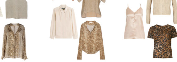
Neither a denim jacket nor a boxy blazer, this blouse expresses Autumn strength in fabric with substance, softness in low contrast prints, and folds that are both soft and deep.
True:
We see and feel the gold in the pink. The colour is light for this Season, and could be a nice hair highlight for Soft Autumn but dark to wear as blush.
Warm colour relative to the neighbours. Without comparing at the same time, we wouldn't know how warm. Our eyes position brightness and darkness level better.
Silky fabric is not traditional for Autumn. An example of the colours knowing what to do, Autumn has versatility of texture. Any fabric can work if it looks like it belongs in the world, even the smooth hard shine of plastic in a bead or an eye. As long as it looks real. Where Autumn gets garbled is when things look artificial, as in, "That would never happen."
Dark:
The glowing coal. The intensity feels as though the heat was turned up. Actually, the blue was turned up. These colours are cooler than True Autumn, and the same warmth as Soft Autumn. What you wouldn't think would be true...
Shiny without being wet. Gleam is controlled; the effect is a glow. Sharper shine, say a lipgloss, says more surrounded with glow from softer textures or you couldn't tell shapes apart. Could you see genie lamp gold earrings, a burgundy silk blouse, and a mahogany wool coat?
This colour is how red and brown often appear in the eye. Wearing it in makeup is a gorgeous example of accidental beauty. Choose matte blush, since we see blush and eye colour at the same time. Neither colour nor shine should take over the eyes.
Shine is better in eyeshadow, as an extension of eyes, perhaps, or we're used to it, or because we see it best when the lid is lowered. A dot of gypsy gold over the center of the iris creates depth, covered with the neutral shadow of lid.
The colour that looks nude in lips is darker than you’d think. In later years, as lip colour may soften, this is still the colour needed to balance the eyes. Skin coloured lips may feel safe but they’re without energy and drain the Dark Autumn face. With the success of natural effects, lips like toasted cameo rose can be fantastic, the colour to create them being more expected.
Is it just me or would that T-shirt be fantastic with the palette navy blue? Jeans. A meant-to-be combination, a casual outfit that says something.
Metallics
Soft:
Glitter can be insistent next to Soft Seasons. Choose natural colours, soft glows over larger areas, granular shimmer, or tighter, stiffer shine for smaller areas.
Summer’s gray influences neutral tones, from white to khaki. In a matte eyeshadow, this colour is great to cool, soften, or tone down shimmer.
A gorgeous eyeshadow with low-key shine. Reserving shimmer on the face to one effect keeps products from getting in each other's way.
True:
Their golden look wears warmth as shimmer, but colour can glow on its own, shimmer not required.
Gold is darker than yellow and softer. We also green tones. Both may be visible neutrals colours, skin, foundation, and in brown hair.
Diffused shine without sudden changes. Light reflects as on leather, not glass. Nothing to squint at.
Dark:
Sharper highlights, coming to a more focused point and nearer white. We recognize Winter’s steep changes in lighting.
Autumn texture plus gleam feels like brocade or luxury rope.
The picture again to reduce scrolling:
Shopping information at URStyle: https://urstyle.fashion/styles/2848934
White
Eyeshadow highlights.
Wedding dresses.
Men’s shirts.
Explain to yourself the difference between the blouses and the white background.
Soft:
Bone.
Is skeleton white too much as my analogies go? Or useful for not dazzling our attention?
Warmish. Grayish. Greenish. And light.
True:
Crackers are all I can think about, even if I close my eyes.
Colours aside, texture is Autumn’s language. Dryness too.
Feel those crackers in your hand.
Saltines, RyeVita, Triscuit...
Move on, Christine.
Dark:
Dark Autumn dances on the line of icy colour as Winter arrives, but colour is too warm to look remotely icy. In selected fabrics, highlights approach white in an otherwise warm, dark version of white … candlelight white.
Shine says more in a velvety surround. Shine in one element of the appearance, and maybe a second in eyeshadow, gives it meaning and opulence. In the Sultan’s tent, light glows from golden lampshades and is absorbed by rugs and couches.
Animals
A lioness quality to the appearance gives these prints a reason for being there that everyone understands. Like black on Winter, it actually means something.
The prints as eyeglass frames. (The podcast episode airing Feb. 26 is all about eyeglass frames, with our guest, Debi Rushworth of Bloom PCA in New Brunswick, Canada. Colour analysts work through frame choices too, an item with more criteria than most.)
Use these golds in eyeshadow designs to repeat yellows in the eyes.
Soft:
Eyeshadows and liners. Sand to soft hazelnut. Too dark and too orange are caution zones. One is harsh, the other is hot. Whether eyes are near the skin tone or darker, their colour will fade. Eye colour shouldn’t be drained by what we wear, whether you’re a Soft Season or a True Winter.
No black. It has no meaning and can look fake, an effect Autumn doesn’t pull off convincingly. Neutral brown, meaning faded brown, for eyeshadow and mascara too, in a darker version still within the palette. Around the eyes, too-warm or too-red looks like irritated eyelids. Better to show our own colours than compete with them. Remember, they're already perfect. Now to make them look even better.
Balance the blouse with a copper pink to berry lipstick. If you were a painter, how much would you soften the berry to balance the print? Do you have a sense of what I mean by balance? Ask if you don’t. The idea is for both to look better together, not one at the expense of the other.
You don’t only have 3 settings (not enough, just right, too much). There are plenty of levels in the middle, especially for the Summer and Autumn Seasons. Combine them and the colour drifts expand that much more. Work your magic. Not everyone has it.
True:
Generous warmth, glowing, full, a dependable world that provides all we need and more.
More Bedouin than Moroccan for being lighter and warmer, sand dunes in the Saharan sun.
No black. Even if the eyes hold up to it, the skin and hair don’t. Dark brown or bronzed purple mascara.
With a tomato red lip. If you were a painting a gorgeous lip above this blouse, how dark would the tomato be?
Which gold would you wear with this blouse? Is there a gold you wouldn’t picture?
Dark:
Like Dumbledore’s office, light is low and intentional. The leather covers of rows of books (the jacket), their spines lined with dark gold binding (the zipper).
Black mascara, though black-brown is often better on Caucasians for looking less brittle. The coolness and saturation of black, and the ultra-blacks in mascara, can make lashes look hard and apart from the face. Black is better in clothes than surrounding the eye. Even if the iris can support it, the white of the eye may appear yellowed, not a healthy effect, and the blood vessels may seem warm and oddly coloured.
Black need not be matte if it can be warmed, with the green and gold colours you see in bronze. Autumn and Winter wear shine well and Dark Seasons manage dark colours best of all.
Wear true black in small areas, mixed with an undeniable warm colour, or in larger areas if matte or smaller areas if shiny. Dangerous just by being there. Dark Autumn is born that way, black plus heat makes us melt in the best way.
With a bronzed rust lip colour. Sheer or opaque, your preference.
Join a new conversation…
When women tell me they ‘can’t get makeup to work’, that’s actually a sign of great discernment, rather than a lack of any skill.
- Florentina Mossou, in reply to a comment in the Aligned Makeup Masterclass blog post series at Chrysalis Colour, Part 4.
In the spirit of looking and feeling better, “IDK what looks good on me.” feels as good as shaking off a job or relationship that isn’t giving back.
As addictive as getting rid of furniture and feeling 50 pounds were taken off, we’re wondering “What else can I get rid of?”
Try this thought: “I’m not even sure I know what ‘looks good’ means.”
These are normal. There's a system at work that pretends to be our friend. It says, ‘Others have these answers, and you should too.’ It works a knowledge gap, a status gap, that it made and pretends to sell us ways to close it. It changes the rules to keep us looking the other way. Very clever.
Back up. Don’t worry. Most people don’t know. All of us can learn.
When you know what colour has to do with you specifically, the system starts giving back. You give it no choice.
The third thing I love about being a colour analyst: It doesn’t discriminate by wealth. Oblivious to labels and logos, it knows that making your best choices begins with knowing yourself.
---