
The video is also here on YouTube.
Gray is a key colour in any wardrobe.
It lights up other colours. It explains and intensifies them.
Gray is the backbone of the wardrobe for all Seasons, including those who wear black to their advantage.
The sophistication of gray is always in style.
Gray is also more challenging to choose for our Season, which is why we're using it today, with tips that would apply to choosing any colour.
We'll focus on blue tinged grays, so the cooler side, Summer and Winter grays.
We’ll also look at neutral grays, both warm and cool. This may be most grays, like it’s most people.
Warm grays have a yellowish, gold, brown, or (sometimes) greenish tone.
Season-specific grays are shown in the Pinterest boards and will be the topic of the podcast at Chrysalis Colour > Podcasts, to publish May 28/21.
I’d be happy to add more or create blog posts if you’d like to see particular comparisons, but I don’t shop with a Pinterest board open on my phone.
You don’t live in a gym, you want the movement in your everyday life. You don’t eat in a test kitchen, you want the nutrition in your own kitchen. And you don’t shop in a colour lab with ideal lights, you shop in stores and on websites.
My job is to help you make your best colour choices before you buy, in the real world that you live in.
A convention that works
The theoretical approach to gray doesn’t help with shopping because,
Gray has wide value (light-dark) range. Many grays could fit into several Seasons on value alone.
On the warm-cool scale, most grays are in between, neutral, they’re a bit of both. Absolutely warm and cool exist, as they do in people, but deciphering this in stores is a lot. Besides, knowing that a gray is cool or cool-neutral doesn’t inform which Season it is or whether it would be a good purchase for you.
Grays are all low in saturation (colour pigment). Some are lower than others, but again, in stores?
Here’s a rule that I believe about what looks good with Winter v Summer gray theory that helps with decisions.
The more saturated the colours, the less saturated the grays.
The less saturated the Season, the more saturated the grays.
This may provide our eyes with balance and it seems to hold true, at least for the cooler Seasons. I’d rather see seafoam green with dove gray than steel, and pomegranate juice with lead or iron gray than with taupe.
We’re shopping.
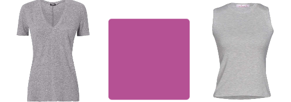
Here we are looking at this T-shirt.

Shopping information: https://urstyle.fashion/styles/2936794
Can you see a colour in it?
I can't.
If asked what colour it would be if more pigment were added, I wouldn’t know. I don’t see a purple or red undertone. There’s some yellow that could be lighting.
Is it warm? Cool? Neutral, as in bit of both?
I have no idea.
Why don’t I know? Because it’s neutral? Light? Both? Neither?
I don’t know why I don’t know, I just don’t.
What if we came at it from another angle and I asked,
does it feel as if it would belong with Summer’s fleecy textures, pearls, and pastel colours,
or Winter’s sharper or harder textures, like coal with glitter and diamonds?
I guess fleece? I could project it holding its own better with pastels than glittery black. I can’t prove it. Texture and reflectivity are related to colour but not the same thing.
Maybe the answer is neither fleece nor diamonds.
The answer that’s most usually right with colour: We need more context.
How to Know, Step 1: Compare it with a similar colour
Here we are with our first T-shirt and a V-neck that we pulled off a shelf.

Shopping info: https://urstyle.fashion/styles/2934914
Same Q, what colour is in the gray?
The first one now looks warmer, yellower or greener or something. The new one is clearly bluer and pinker.
If you change the way you look at things, the things you look at change.
—Wayne Dyer
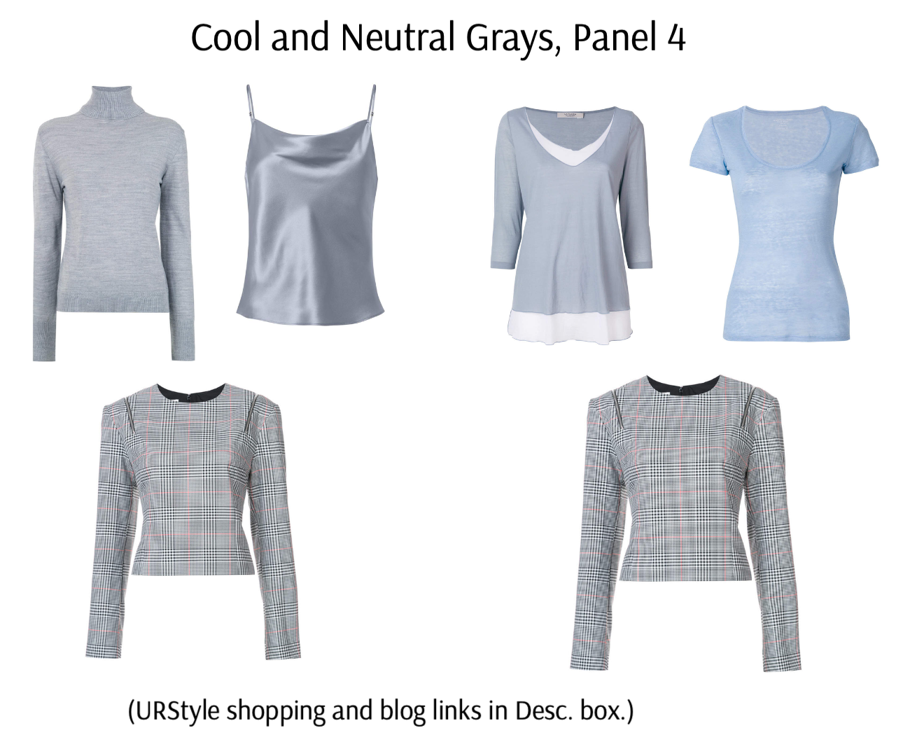
We’ll come back to these after a digression for some new tops.

Shopping info: https://urstyle.fashion/styles/2936800
In the top row, we have two (True) Summer grays in the top row centre, plus a pastel blue T-shirt. The pigment in the grays is visible, you know that coloured back up, you’d add blue or blue-green.
What about the turtleneck though?
The pigment is less obvious. Maybe it’s Winter, or maybe it’s Summer at the Winter border.
I wouldn’t see the turtleneck balancing black pants. The pants might seem heavy, wider, shapeless, or blunt, as would the body parts wearing them. Of course, I don’t know for sure, I’m just imagining.
Switch it up. Black as the top and the turtleneck as the pants… not better. Confusing. The turtleneck colour might seem spindly. In a counter-intuitive effect that does happen, Summer colour might look wider and diffused on a Winter person. Winter colours reflect to a sharper point and are more flattering to tighten the outline of Winter-coloured people.
Being very smart, you say, “To decipher the turtleneck, I need more context.”
And I say, “Coming right up.”
How to Know, Step 2: Compare it with a colour you know
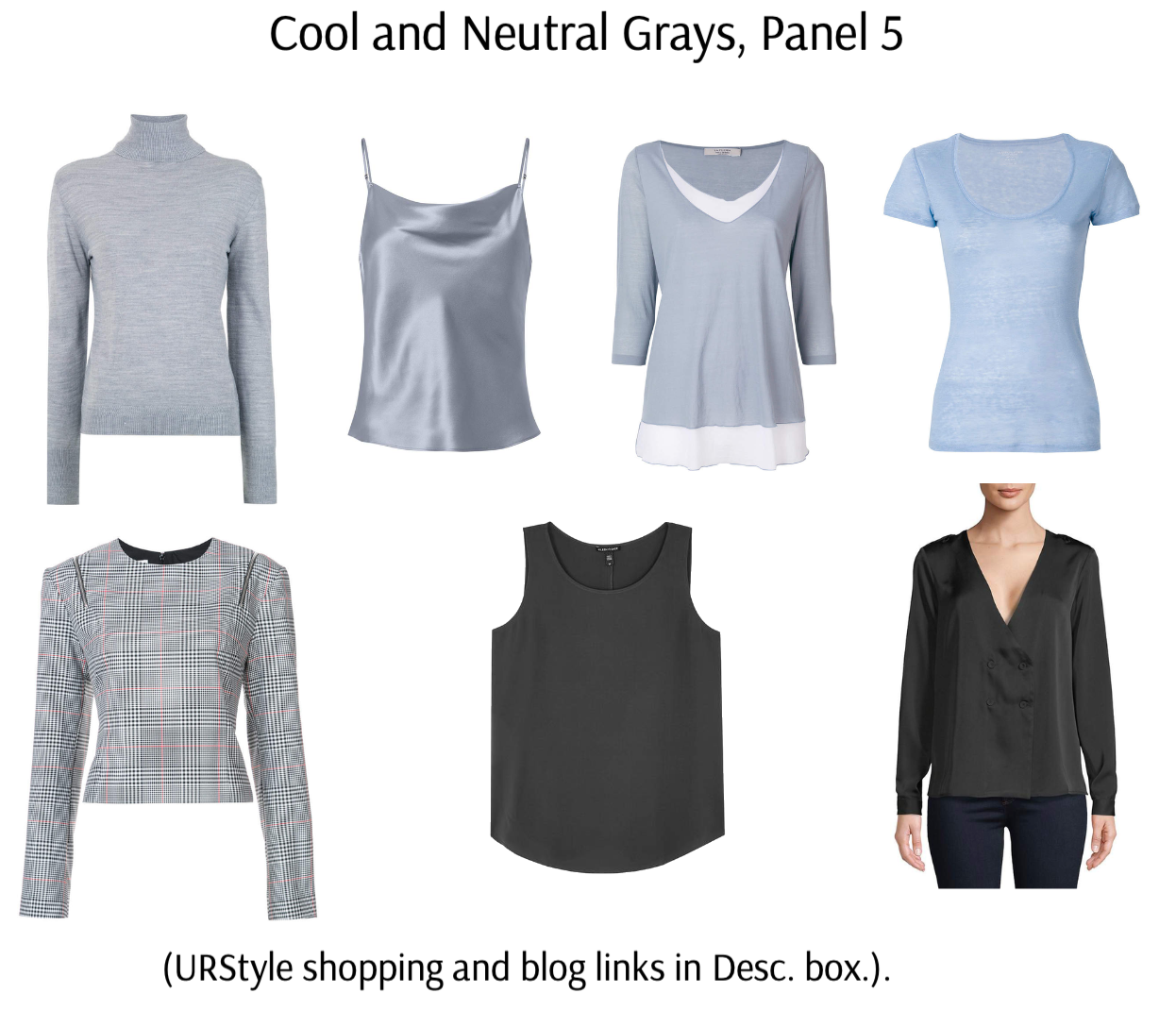
Shopping info: https://urstyle.fashion/styles/2936813
Adding the plaid top in the lower row. It is black, white, and red, with a high likelihood of being Winter. The item is duplicated in the bottom row for easier comparisons.
You can most always find black or white in stores, real or virtual. Black and white and red is even better.
The turtleneck now looks blue and happy and comfortable with the top row.
I wouldn’t see it as a superb choice for the plaid top or moved into the lower row. Maybe as jeans, in their way of going with anything, but that’s more culture than colour.
An important Q with gray: Is it good enough?
The answer comes down to your opinion, which will never be wrong. Gray can figure out the gap.
Staying with this useful image, let’s add some darker grays.
Shopping info: https://urstyle.fashion/styles/2936820
Harder again to see the colour. Is that because they’re dark, or maybe they’re Winter without much pigment?
I'm not sure.
Are they cool, warm, or neutral?
Without comparisons, nobody knows.
They do look decent in the lower row. Inserted in the upper row, they might feel leaden, heavy, flat, or lifeless. They seem to lack the misty, washed, water, air energies of Summer colours, as well as the trace of pink reflection.
They go off the dark edge for Summer palettes, but might they belong in the business and professional palettes? These are terrific for expanding choices, but because there are more darks and fewer colours, they may need more practice to work with. In any case, they harmonize with the same colours as the traditional palettes and the same Seasonal rules apply.
Bright Winter is the more saturated, lightest Winter.
Soft Summer is the least saturated, darkest Summer.
Is there a crossover place in the darker tones?
Yes.
If your eyes can’t tell, does it matter?
No, there might still be good outfit possibilities.
The dark items are an example of very similar colours, one matte, the other with more sheen.They have green cast, which may be Winter or Autumn, both having a version of olive. All we want to know is whether you would add it to your wardrobe. Let's keep going.
In the next image, we’ll bring back the tops we’ve seen and a few colours from our palettes or in-store items.
How to Know, Step 3: Compare it with 2 colours you know.

Shopping info: https://urstyle.fashion/styles/2929536
Now an exercise in looking at 2 things at once.
Why?
Because that’s how we see.
Tops with pants, eyes with blush, lipstick with earrings with hair colour.
We see all the parts together, a streamlined whole person.
PCA is a system for picking great parts.
What you want to know: Do I buy this or not?
Let your eyes rest on one item and a colour square, or the row of three, if your eyes feel better making comparisons that way.
Winter colour squares on the right.
Summer colour squares on the left.
Who would wear it suggestions (below) look for enough in common with the Season to get along and make a few (or many) combinations.
Confirm all purchases at home. Buy only if the item can returned.
Row 1:
The gray T-shirt looks yellow or green next to the fuchsia, which is what will happen to those same colours in the skin tone, hair, or other features. Also problematic is that the fuchsia looks frozen next to the T-shirt, not a good makeup look. (Who would wear it: Light Summer)
The tank top is better if I had to choose one and might be fine with the fuchsia in an outfit. I’m still seeing the fuchsia as dominant, too big, too bright, too cold, and might not use it as the lipstick, but this is an extreme colour, saturated by a computer, and a more human version of a True Winter colour might be very good. The way to know is to try them together. (Who would wear it: True Winter, Bright Winter, Bright Spring.)
With the colour square, I prefer the tank top.
Row 2:
The pink in the T-shirt is continuous with the same tones in the red square. They’re comfortable together. The gray looks good and so does the red. They have similar energy, with neither pulling my attention towards or away from itself. They’re bringing out the best in one another. (Who would wear it: True Summer, True Winter in the matte or softer side rather than the extreme or intense side.)
The sleeveless top is balanced enough with the red to suggest Summer, but it also looks yellow and the red as a lipstick might look blue, suggesting a warmer Summer or Season. (Who would wear it: Light Summer, Light Spring, Bright Spring.)
Choosing only one, I go with the V-neck T-shirt with the red square.
Row 3:
The tunic works well with the black, and with the dark pants on the model. The colour can hold its own, appear as it really is, and shares colour impressions with the black. It no longer appears greenish, as it may have in Panel 5, though it still carries green tones, an example of Winter’s olive, found in many Winter skin tones. (Who would wear it: True Winter, Bright Winter, Bright Spring.)
The tank top is blueish, which is belonging for being cool, as the black probably is. Between this tank and the one above it in Row 1, I prefer the one in Row 1 with black. (Who would wear it: True, Light, or Soft Summer.)
I prefer the tunic with black.
Row 4:
Racerback tank to the gray block is easy, no competition or distraction. ( (Who would wear it: True or Light Summer.)
The strapless top is yellowish, like the sleeveless in Row 2, with a stronger yellow effect, possibly related to the steely sheen. Strong yellow puts Winter in mind. The gray block and strapless top are OK, but I can look at the other pair longer and more calmly. (Who would wear it: Bright Winter, Light Summer, Dark Winter, Bright Spring.)
I choose the racerback with the gray square.
Row 5:
Our turtleneck from Panel 4 next to the Winter blue is not balancing the blue square. In an outfit, the turtleneck might be ignored and looks tired, rather than the gorgeous, lovely watercolour wash we want from Summer colours at their best. The longer I look at it next to the blue block, the more I want to move my eyes to the pair on the other side. (Who would wear it: True Summer.)
The darker sweater is better able to balance the blue. (Who would wear it: Dark Winter or I’m not sure, I’d try it at home with my palette.)
I choose the darker turtleneck as better with black.
Row 6:
The same turtleneck as in Row 5, here it looks much better, more colourful and less blurred. The point of this combination would be clear. They share something. In an outfit, the viewer’s attention would be evenly divided, settled, and comfortable. You could look at these two colours together for any length of time. Adding the charcoal block above as eyeliner and red block above that as lip colour, would be fabulous. (Who would wear it: True Summer.)
The dark tank top seems heavy next to the softer blue. The greenish cast and density of the colour look rather solid related to the turtleneck. Given the choice, I’d prefer the charcoal block above as the pants over the gray in the tank. (Who would wear it: Dark Winter, Bright Spring, True Winter, Soft Autumn.)
I choose the turtleneck with the blue square.
If you thought differently or wondered why I in/ex-cluded certain Seasons, please ask in the comments.
---