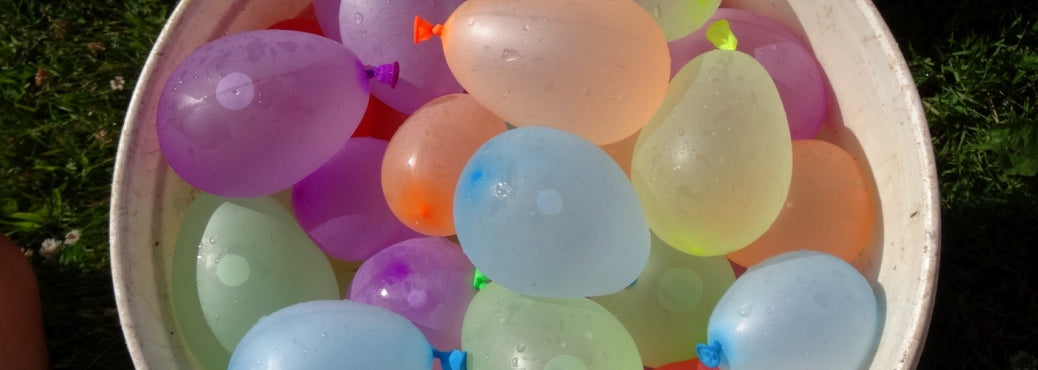
Something in Light Spring renders me speechless. Like the good witch, they could float up off the ground at any moment in a swirl of sweet, sparkling dust. The colouring is so gentle, almost transparent, and yet they twinkle, move, and are full of life.
A magic spell would not surprise, most often one that brings another person something they desire. The Summer wish to do good in the world is mixed with the absence of attachment or over thinking that is Spring. Spring is goodness, happiness, and smiles for their own sake. Wearing their own colours, the sun itself pours out of the iris of the eyes.


If we take fair to mean light, Light Spring really is the fairest of them all. Colours of almond milk, linen, light peach, and sand. Eyeshadow grays are less blue than in the Summers. Light browns appear. Another option, not shown, is a bit of green in the yellow or brown, as light khaki or golden greens. Not army green, more floaty than that.
Small shifts in darkness level are amplified on this colouring, where they might be less significant on another. Darkness is hard to control. Even in a tiny area, as black mascara, the lashes attract lots of attention, appearing almost aggressive in a landscape foreign to that sensation.
Every Season has light, medium, and dark colours and wears them in attire as well as cosmetics. For Light Seasons, the darker choices are the lightest on a full white to black scale, hovering somewhere around the middle.
Definition of features happens beautifully using lighter colours than other Seasons. Light is another relative term. In fact, because Summer colours are pastel, they may appear darker than Winter's icy light colours. This is because the Summer light to dark range spans chalk to pewter, and this applies to every colour. Winter's range is wider, from white to black, so it makes sense that their light colours are nearer to white.
Colour clarity is quite high in Spring, meaning that pigments are pure. Transparency is a form of clarity and happens to look great in makeup, allowing the reflectivity of light from the skin to come through. Repeating that in cosmetic effect adds magic to magic, perfectly consistent and aligned. Sheer cosmetics also glisten without frost, in the same way as the skin. Lastly, sheer cosmetics allow for a lightweight colour deposit.
Sometimes, this person is very Summer looking and does better in the cooler, pinker lipstick and blush. At other times, she can be warmer or more beige than ash, and the melon colours look lovely on the face. If the products are sheer, either could work well.
How to swatch makeup
Paint a 1 inch square of the cosmetic on a page of white paper, heavily enough that no white paper comes through. Make a big area, at least as big as the swatches in your book.
If there are several cosmetic patches on the page, cover them with white paper. You want to see only the colour swatch book and the product in question.
Lay your swatch book above the cosmetic area. Hold down the bottom strip with one hand. Looking across at both the colour and the swatches, flip the pages of the book past the makeup. Open the pages enough to see the entire strip.
The colours should look well together, a feeling of colours looking better for being together. The cosmetic and the swatches become more colourful, crisper, and better defined by being next to one another. If either one drops back, seems duller, weaker, or you find yourself ignoring it, it may not be the best choice.
Evaluate the cosmetic with the length of the palette strip. Your attention should be divided fairly evenly and the effect appealing, as much for the lighter colours as the dark ones.
When the strips with the colours most similar to the cosmetic go by, slow down. The cosmetic should look like a plausible extension of the strip, meaning that you could slide the cosmetic colour among the swatches fairly easily.
This process is equally effective with eyeliner, bronzer, any cosmetic you choose. Even mascara.
-----
A magic spell would not surprise, most often one that brings another person something they desire. The Summer wish to do good in the world is mixed with the absence of attachment or over thinking that is Spring. Spring is goodness, happiness, and smiles for their own sake. Wearing their own colours, the sun itself pours out of the iris of the eyes.


If we take fair to mean light, Light Spring really is the fairest of them all. Colours of almond milk, linen, light peach, and sand. Eyeshadow grays are less blue than in the Summers. Light browns appear. Another option, not shown, is a bit of green in the yellow or brown, as light khaki or golden greens. Not army green, more floaty than that.
Small shifts in darkness level are amplified on this colouring, where they might be less significant on another. Darkness is hard to control. Even in a tiny area, as black mascara, the lashes attract lots of attention, appearing almost aggressive in a landscape foreign to that sensation.
Every Season has light, medium, and dark colours and wears them in attire as well as cosmetics. For Light Seasons, the darker choices are the lightest on a full white to black scale, hovering somewhere around the middle.
Definition of features happens beautifully using lighter colours than other Seasons. Light is another relative term. In fact, because Summer colours are pastel, they may appear darker than Winter's icy light colours. This is because the Summer light to dark range spans chalk to pewter, and this applies to every colour. Winter's range is wider, from white to black, so it makes sense that their light colours are nearer to white.
Colour clarity is quite high in Spring, meaning that pigments are pure. Transparency is a form of clarity and happens to look great in makeup, allowing the reflectivity of light from the skin to come through. Repeating that in cosmetic effect adds magic to magic, perfectly consistent and aligned. Sheer cosmetics also glisten without frost, in the same way as the skin. Lastly, sheer cosmetics allow for a lightweight colour deposit.
Sometimes, this person is very Summer looking and does better in the cooler, pinker lipstick and blush. At other times, she can be warmer or more beige than ash, and the melon colours look lovely on the face. If the products are sheer, either could work well.
How to swatch makeup
Paint a 1 inch square of the cosmetic on a page of white paper, heavily enough that no white paper comes through. Make a big area, at least as big as the swatches in your book.
If there are several cosmetic patches on the page, cover them with white paper. You want to see only the colour swatch book and the product in question.
Lay your swatch book above the cosmetic area. Hold down the bottom strip with one hand. Looking across at both the colour and the swatches, flip the pages of the book past the makeup. Open the pages enough to see the entire strip.
The colours should look well together, a feeling of colours looking better for being together. The cosmetic and the swatches become more colourful, crisper, and better defined by being next to one another. If either one drops back, seems duller, weaker, or you find yourself ignoring it, it may not be the best choice.
Evaluate the cosmetic with the length of the palette strip. Your attention should be divided fairly evenly and the effect appealing, as much for the lighter colours as the dark ones.
When the strips with the colours most similar to the cosmetic go by, slow down. The cosmetic should look like a plausible extension of the strip, meaning that you could slide the cosmetic colour among the swatches fairly easily.
This process is equally effective with eyeliner, bronzer, any cosmetic you choose. Even mascara.
-----


