
For all Seasons, ideas that we’ll see in various places:
1. Stay inside the value range, meaning the light to dark range for the Season. Taking that one step further, stay inside the value range for blue, which can go darker than say yellow, which is a lighter colour by nature.
2. Look for a colour to fit or belong with the Season palette strip of similar colours. Your odds are better using the entire strip than aiming for an identical match for a single colour.
3. Your natural colours have 3 properties, a particular warm-cool setting, a soft-bright setting, and a certain light dark range. Traditional colour-wheel primary blue is cool but there are thousands of blues. I find the warmth or coolness of blue less predictable than other colours. With blue, as it warms, it can become greener as yellow mixes in like turquoise, or violet as red mixes in, but this is harder to apply in practice than for yellow or red. My solution is to focus on what I trust myself to know, meaning the soft to bright aspect and the light to dark range. If the blue is too bright, say, or too dark to be reasonable with the palette, it belongs with another Season. Secondly, I make colour combinations to decide how well the blue works.
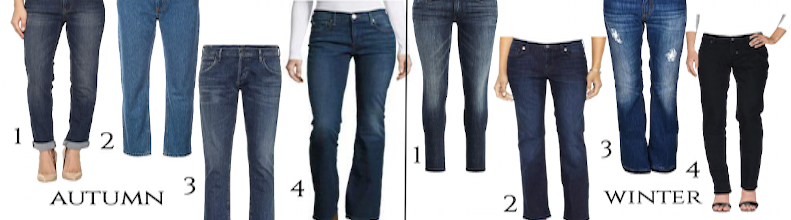
Jeans for 12 Seasons

Shopping information: https://urstyle.fashion/styles/3348184
From the image above,
Spring
In #1, we see the brightness as a lively blue, with more colour pop and less sense of softness (visible gray) than Summer. The jeans would be hard to slide into the other rows.
#2 have a green tinge that looks more like Caribbean ocean than an opaque, dense, heavy, or metallic colour.
#3 are at the darker end, maybe best for True and Bright Spring, with enough blueness that any Spring could wear them (and enough blue and darkness to be fine for any Winter).
#4 might be an example of a good average pair, with some yellow coming through as the warmth of Spring. They have a lightweight feeling that works well for Spring.
Summer
These blues are softer, meaning less blue, than Spring, and they have a wash of pink or violet in the blue. They're inside value range for the Summers, and only moderately faded because neither Summer colours nor their neutrals are faded to the point of colourless, the opposite actually, neutrals have colour.
Pair #2 is slightly greenish, a soft blue-green, with less green than Spring #2. If you picture moving the Summer jeans over to Spring, they’d have less energy.
Autumn
Autumn is soft compared with Winter and we see a little more fade, as well as less sense of black.
Once again, we are inside value range for the blues. #2 is lighter and might be a good choice for Soft Autumn.
The strength and purpose of jeans aligns well with Autumn colours and textures. A dark gold, orange or burnt orange cast in the fabric as well as the stitching, helps blue belong in a warm group of colours.
Coloured jeans are an excellent option for Autumn, available in dark teal or bronzy purple.
Winter
Winter colours are dark and bright. Not every colour is dark, but they are all bright. The more faded pairs are either quite dark, quite blue, or both.
The orange cast of Autumn is mostly gone, though Dark Winter has some Autumn mixed in and can figure out a touch of dark orange, as pairs #1 and #2.
For True and Bright Winter, choose white or silver stitching, depending on the styling and rest of the item, meaning if they’re richly coloured and dark or if the design is relaxed, orange stitching is inherent and understood in jeans. Midnight blue or black with silver or red details would suit any Winter.
Spring Jeans
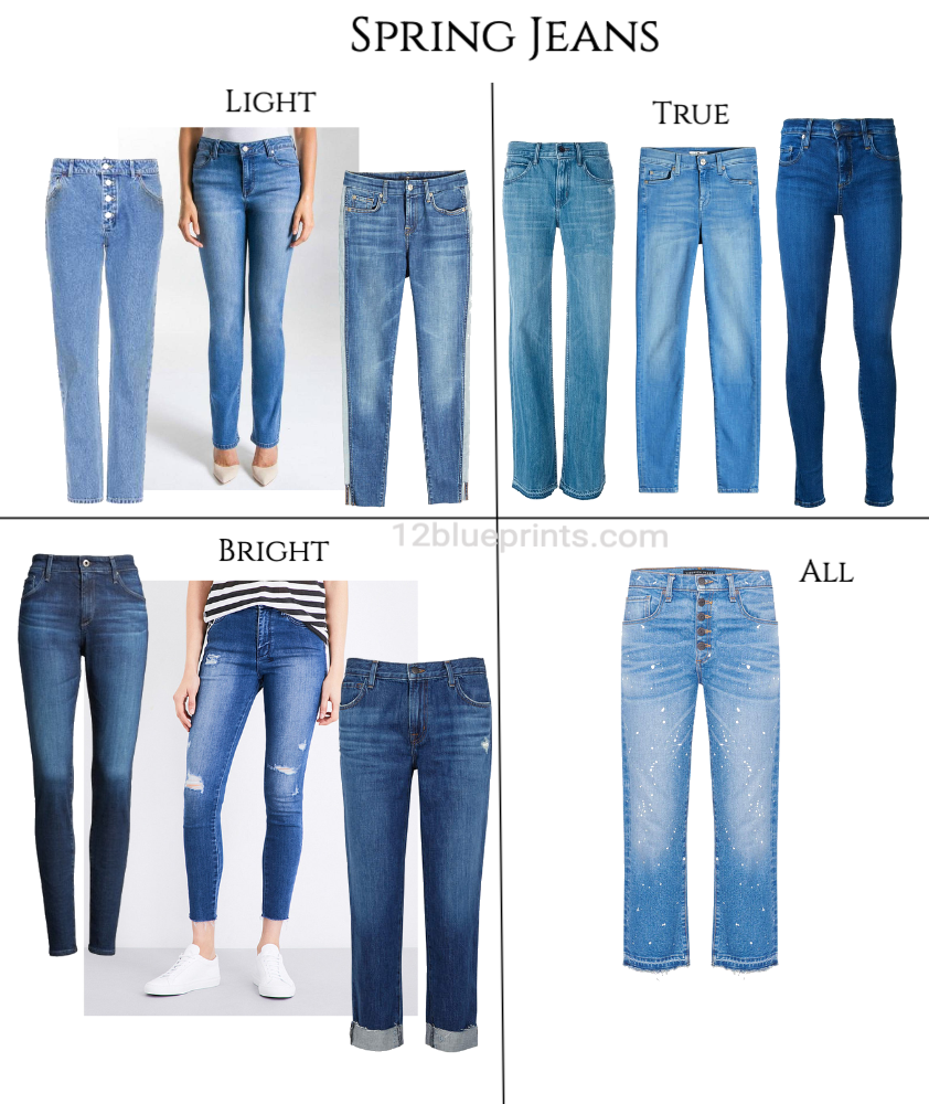
Shopping information: https://urstyle.fashion/styles/3350387
The general concept of Spring colour is lightness without getting too near white, and brightness, meaning more colour pigment than Summer.
The Light Spring colours could be a reasonable, believable extension of the blue palette strip. Some are closer to violet, like the first pair, which could be fine for Light Summer too, and some are greener with even more blue pigment, such as the middle pair.
The pair on the right is fairly faded. They're not as bright as the other two pairs and the fade helps lighten the colour without fading to white, which looks sharp or separate.They're not obviously pink for Summer, gold for Autumn, or dark for Winter. They’re not beyond the darkest blue of the Light Spring palette and worn with any of the palette colours, if I saw the combination at the market, it would be perfectly fine
True Spring is brighter than Light Spring and we see more colour pigment. The blue can be more turquoise, like the pair on the left, or a bright clear blue like the middle pair.
True Spring is darker than Light Spring and can balance a lot of pigment colour, as with the pair on the right. They're a little green with more pigment than Autumn would have, and they hold their own nicely next to the palette colours. These may be at the brightness and darkness limits, and good choice for Bright Spring as well.
Bright Spring takes yet another step brighter and darker. We see a light, bright navy blue that works well with the black and white top and could be a great choice for Bright Winter as well. The darker options are on the left, in a pair that’s nice with the palette emerald, and a pair on the right that has more darkness without suggesting black.
In the All box is a pair that any Spring could wear, bright enough for all Springs, light enough for Light Spring, with sparkles to raise the energy and offer a lighter option for Bright Spring.
Summer Jeans
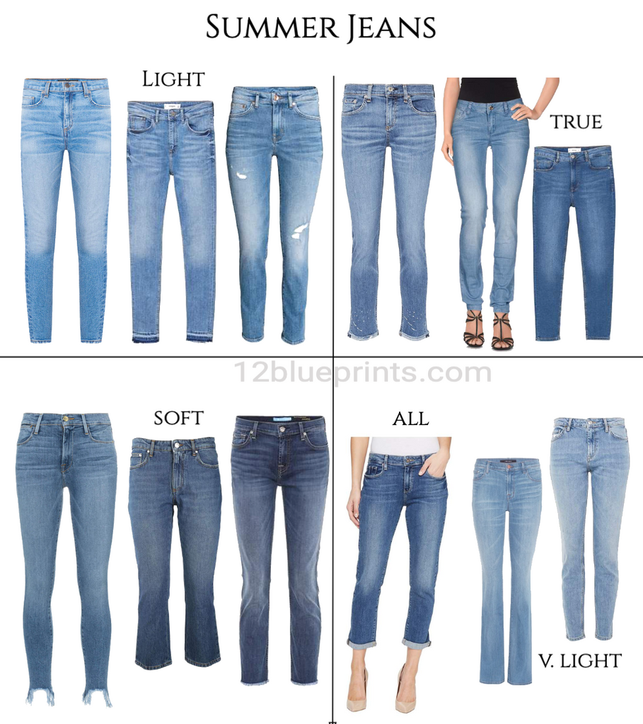
Shopping information: https://urstyle.fashion/styles/3348191
Summer is softer than Spring, with colours that would belong in the same world as pastels. Blues have a moderate light to dark range, medium light to medium dark without extremes, and a pinkish violet cast or a blue green wash in a softer version than Spring.
Beginning with the lower right quadrant: the All pair look a lot like the darker Light Spring pair, a medium-clear medium-dark navy. This is the dark side of Light Summer but Light Season doesn’t mean everything you wear is light; it does mean the darks don’t go much darker than this.
The 2 pairs marked V. Light are examples of jeans with a lower energy, perhaps too light, too soft, or both. The don’t subtract for Summer, but neither do they add. We see jeans as neutrals so these can works as Summer choices, but I wanted blues with more personality, that participate more in the overall look.
In Light Summer, the pair on the left is brighter and could easily work for Light Spring. It is also more aqua and less pink than the middle and right pairs, as Sp yellow blends into Summer blue. The middle and right pairs are pinker and softer than anything we’d find in Spring, but not as light or soft as the pairs marked V. Light. About the pair marked All, they could be at the darker end of Light Summer, bright enough with a fair bit of blue, only medium dark.
In True Summer, the pink violet is more noticeable than with Light Summer. You see a light-dark range, also a bright-soft range, all of which could work well for this Season, as could the pair marked All. True Summer takes a step darker than Light Summer, while remaining a soft pastel-based group of colours.
In Soft Summer, Autumn is arriving, adding touches of gold to the colours, still faint but visible compared with Light Summer above. Soft Summer is also the darkest of the Summers, which we see in the middle and right pairs, though still within the darkness range with the pinkish tone of Summer. Soft Summer is the softest Summer, and you may find these to have less blue or pop than the rows above, despite being darker. The All pair is more pigmented but with the neutral-ness of jeans and the moderate darkness, they easily pass the 80-20 rule, being more Summer than Spring, Autumn, or Winter.
Autumn Jeans
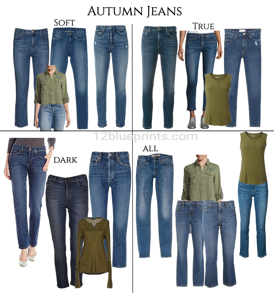
Shopping information: https://urstyle.fashion/styles/3354647
I expected Autumn and jeans to be a home run, easily creating the strong, rich looks using soft colour, the magical talent Autumn has, and the old gold and burnt orange of jeans making things better. What happened was, I found it challenging to pick jeans just with the palette. That's not uncommon with certain colours but I had not encountered it with a clothing category. Even if I stayed fairly dark, since darkness is an Autumn colour property, along with warm and soft, I was questioning my choices.
I had a conceptual idea of the colours that stayed consistent with what I've written in the past, but when it came to refining real-world choices, it was challenging. How I solve these situations when I need another way besides the palette is this: I put the colours to work. I make outfits, looking for equal energy, not one dominant or both washed out. You see the 3 olive green tops I chose for Soft, True, and Dark Autumn, and they made the job easier. This is an example of using reference items to shop, which we demo'd with images in the Nextdoor Seasons Colours video.
The jeans in Soft Autumn are medium dark, but they’re not as soft as I started with. In the lower right quadrant, there are 2 pairs shown that I considered and in practice, both would be fine but with the soft olive top, but the look seemed a bit washed out. The pair at the front looks pinkish. The darker pair at the rear is better but I find the combinations in the Soft Autumn square at the top stronger and better. The jeans in the picture with the woman wearing the soft olive top are another of those “Yes, they’re jeans, they’re neutral enough, but they don’t enrich the look, they're just there." Placeholders rather than participants in the presentation.
In True Autumn, what happens? Colour is brighter meaning more colour pigment. Bright is not the same as warm although folks often see warm colour as bright, explaining why Autumn looks can seem to glow when technically, Autumn colour is quite muted.
I considered the lightest of the turquoise teal colours in the palette strip, shown in the combination with the olive in the lower right, but I didn’t see them as better together. I found them more on the weird side, possibly because the jeans may be a Spring turquoise. The ones that stayed with True Autumn have a lot of visible gold and are a little more pigmented than Soft Autumn without being very bright. The pair on the far right in True Autumn are more blue and still look good with the olive top, with enough golden orange coming through.
With Dark Autumn, the choices are fairly dark, since darkness makes blue work better in jeans. These also have more blue pigment than the other Autumn groups. The pair on the left are basic navy blue, a little golden orange, not too bright. The centre pair has a bronzy blue purple tone that looks great with this Season, a variation on warm dark blue. The pair on the right could work for True Autumn as well, a basic jeans energy that would be harder to place in the other groups.
The pair marked All are standard jeans with an Autumn feel, with some warm soft orange coming through, medium soft pigment, and medium dark in value. Autumn can work with that.
Winter Jeans
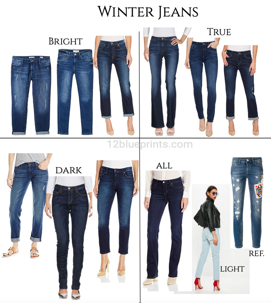
Shopping information: https://urstyle.fashion/styles/3348177
Winter colour properties are bright, cool, and dark. Black is part of Winter blue jeans for a few reasons.
1. It makes the jeans more identifiable with Winter, moving them out of the other Seasons.
2. Darkness extremes create the opportunity for contrast. Light or bright items can be worn with them, midnight blue being a nice alternative to black, making a high contrast situation that happens to look excellent on Winter people.
3. Black in jeans raises the brightness as well as the darkness, to balance outfits with bright colours. Softly coloured jeans with bright tops (or people) can look more faded or worn than they are.
4. Winter colour is bright so items tend to look new and the parts of a look, including jeans, are mutually enhancing when the other parts are new looking as well.
Black isn't a necessity though, as the brighter lighter blue pair we saw back in Bright Spring.
Bright Winter is the brightest of the Winters and we expect to see lots of blue, which we do. There’s some fading over the leg and other places but the waist and hem where the blue meets the other parts of the outfit are rich in pigment. Bright Winter is also not as dark overall as the other Winters, although it extends from black to white in the extremes, and we see lots of blue with less darkness. The middle pair is a lot like the Dark Winter pair on the right, but lighter and look brighter.
True Winter is softer and darker than Bright Winter. We see a step less blue pigment and more darkness, though the pairs on the left and right of Bright Winter would be good as well. There is barely any golden or orange cast in the fabric and the stitching is either white, black, or not obviously orange. Depending on the person and the intention for the item, some burnt orange stitching would be fine, being understood as part of jeans, and less visible when the fabric is richly pigmented and dark.
Dark Winter is the softest Winter, and the pair on the left seems about the minimum to balance Dark Winter combinations. The faded areas still retain a fair bit of colour and darkness. The centre pair has the golden orange cast of Autumn but it’s faint, in an otherwise dark blue-purplish navy. The pair on the left is a dark teal and has an opaque or dense feeling, where even the light areas are dark compared with the other pairs.
In the All pair, we see enough red-purple tone coming through for any Winter, and good darkness. About the Light image of the woman with the red heels, although near white is in value range for Winter and this colour could belong with the icy colours, the effect in denim still reads a bit soft, meaning it’s hard to create icy-coloured denim. Light soft colour can have a similar effect to pastels (though this is too light to qualify as pastel), meaning the body shape can seem wide or rounded, without enough darkness to tighten the edges of the silhouette. This might be a good icy-ish blue since it does create high contrast and the colour is further from the face, for an outfit that could be terrific in a modern trendy way.
The jeans marked Ref. with the playing card on the leg are another example of using a reference item for shopping. The colours in the card have similar colour properties as the red, yellow, white, and black as the items you’d be wearing with the jeans. You see how faded the jeans look with it, whereas the combination would be more balanced if you laid the card on the other pairs on the page.
Your natural colours are your built-in reference point for everything you buy. Knowing those colours comes from a live colour analysis experience. Then you know your track and as the winds of fashion swirl around and around, you stay on your track.
You may find that you spend less money than you do right now. You’ll go into the same stores, make different decisions, and leave with a different pair of jeans.
Learning to work with your own colours takes a little practice. It may be easy to overestimate how far you can get in a week. I promise that it's even easier to underestimate how far you can get in a year.